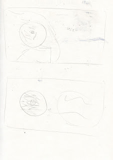
Based on my research into Animal Welfare campaigns, and the techniques they employ to generate sympathy, I decided to develop my idea completely employing some of their techniques. Once again having a focus on incorporating typography into my design, I mocked up an idea taking inspiration from the 'S' in the '36 days of type' post, using selective negative space to create a layered/3 dimensional effect.
I was actually really surprised with how this image turned out as I didn't think that I could animate (I must be getting better!) - although the style is still a bit digital and cold, I think it communicates well in terms of the concept. I chose to use this 3D cutout effect in order to make it seem quite life like, and to remind the reader that it is real animals that are being discussed in the article - I feel I have further conveyed this by use of subtle animation. The concept behind the peep hole was to create a sense of elephants being in captivity and separated from their families etc, quite a heavy concept but highly communicative, aswell as creating focus on it's eye.
I think this image is effective in terms of concept and creating immersive/interactive elements, but In terms of visual quality I don't think this looks alot like my work? It's a little bit too realistic - I think with this kind of thing, unless it does have an illustrative quality, why not just use a photograph? what does drawing it in a realistic style achieve? I still think this needs further development, but is a good visualisation of what i'm trying to achieve - more about the process of making interactive immersive content, than the image.


No comments:
Post a Comment