Thursday 29 October 2015

Responsive: Initial Thoughts + Study Task 1

Possible competitions:
YCN Briefs
House Of Illustration - War Horse
Penguin Random House Design Awards
Brief Box
11 Seconds Club
Loop De Loop
Secret 7 

How to approach a vague brief?
Ask questions!!!
What's Involved specifically?
How many colours?
Any reference material?
how many pages?
how many characters etc?
Make sure you know exactly what is required for the brief.


Study Task 1  - Brief Selection - What is the Problem? (Part 1)

Secret 7

The substantial brief I am currently most interested in is Secret 7, which unfortunately is not live yet, however I am really excited to find out what the songs will be. I think the brief will be interesting in terms of pushing me out of my comfort zone, to create images for not only the songs I like, but songs that might be challenging to represent visually. I think this brief will allow me to fulfill several criteria for success within this module, as I feel that aswell as getting yourself public recognition, it is also to  gain confidence with working to dimensions/specifications, and clients. This brief in particular will do all of those things, aswell as giving me an opportunity to exercise my creative skills for a live brief. As the actual brief/tracks have not been released yet, it is difficult to identify any problems at this stage, however I know that I will be designing artwork in response to 7 different tracks, in order for them to be printed, exhibited and sold to raise money for a charity. 

Brief Box - Visual Identity for Painter & Decorator Alison


I feel really drawn to this brief, and is linked to the area of design/illustration that I am interested in. This brief provides the opportunity to design for a client with a requirement of reflected the clients interests, which also appeal to me; strong use of colour, geometry and pattern. In terms of fulfilling criteria for the module, It will once again provide exposure (not alot), but also give me experience in designing for clients. The main issues I am picking up from reading the brief, are that it is quite vague once again, and if this was an actual client I would want to meet them and get to know them as a person before giving them a visual identity. The brief does not specify the age of the client, or how long she has been painting and decorating for, which I think is another really important aspect that would need to be known in order to create a successful submission. Also there is no concrete deadline, which is clearly an issue.

Illustration Friday


Once again, not a hugely rewarding brief, but really great for generating work for my portfolio. I would ideally like to do a handful of these over the course of the module, and see how the subject matter effects my ways of working.

What is the problem? (Part 2) - Secret 7

  • What problem(s) are identified by the brief?
Album covers for the 2016 tracklist for secret 7 need to be designed in order to raise money for charity (unsure what this year's will be).

  • What is the brief asking you to do about it/them?
The brief is asking 
  • What is the brief trying to achieve?
Aswell as celebrating the successes of 7 musician/artists/bands, the competition aims to support charities and gain exposure for them, funded by people buying the artwork. There is a large sense of trying to revive the culture of vinyls and physical CD/album artwork.

  • Who will benefit?
People effected by the disease that the charity supports, myself if I won as I would receive publicity. 
  • Who is the audience?
As the competition is quite well known, it is heavily received by music and art fans, aswell as the general public. Usually there are alot of established artists that enter the competition, creating more buzz. 
  • Can you foresee any problems in responding to the brief?
The only problem I can see at the moment is not knowing who the judges are for the competition. As the competition will be judged very subjectively, it would help to know who will be judging in order to impress them. 

Tuesday 27 October 2015

Print Induction 2: Using Spot Colour Channels in Photoshop


Pantone Spot Colour Reference System

Printing Using Spot Colour Channels


- Grey Channel is the positive for Black Ink


- New spot channel / Very important to name the colour for reference


- Very simple way of creating positives for different layers of colour 

Printing with 3 colours, using spot colour channels


- Using colour range to seperate certain colours in the image . When selected, choose a different spot colour for each channel and repeat. 


- Once you have your 3 spot colour channels, make sure it doesn't need cleaning up. (use levels to get rid of light bits of grey)

*** Also Save Image, and try 'Split Channels' to print separate positives for each channel
If you split the channels, you cannot undo it.

How to print out Positives from Spot Colour Channels

- Save as TIFF or PSD files, so that Spot Colours is ticked


- Open Illustrator, and place new file


- Save file, Output options, Mode: Seperations. 


- Make sure previous options have been selected.
- AAAAAND PRINT

*Trapping Ink

Wednesday 21 October 2015

About The Author: Visual Journal - Peer Feedback


Peer Feedback 

From taking part in a group critique with my course mates, I gained a good amount of feedback about the work produced in my visual journal, and where to take it further. I had a lot of positive feedback about the strength of my ideas and how I have used research to develop them, the use of motifs and symbolism in my drawings, and the overall visual quality of my work. I was really pleased to hear that my gouache work was effective, as I have been battling with gouache throughout the course. 

Some suggestions I received were based on exploring medias such as dip pens more to create different visual qualities. I have tried to use dip pen in my visual journal so far, however I feel like it really limits the way I draw and is something I need to work on. One of the main discussions in my critique, was based on the way that I have used plants to refer to Calvino's upbringing around botany and plants, and how this aided his inquisitive nature and the way he creatively thinks of plots etc. So far I have been using images of calvino and plants to create some sort of link, however I feel that the images produced so far have been really cliche and boring. Based on this opinion, I have been recommended to explore the idea of plants and motifs in different, non cliche ways, which is something I am really going to need to think about. 

Self Evaluation

So far in my visual exploration, I have really enjoyed using character because I really love drawing people. however I feel that to push my project further, I need to stop looking at Calvino in the obvious ways and start to think more speculatively, referring back to the idea of not using cliches. In terms of improvement, I think it's just the general breadth of ideas so far, as it appears to be quite limited. I intend to start looking at aspects of his novels once again, and bringing them together with the research that I have found so far. Throughout my whole academic, creative career, I have always felt the need to be precious in sketchbooks, which really limits me an my idea generation. I need to work on playing more in my sketchbook using more wet media, as I don't tend to use it a lot. 

About The Author: Visual Journal Exploration


I started my visual journal by drawing my author using various reference materials, as I felt this would be a good place to start. I created drawings based on alot of my research into Calvino's life and ubringing, having quite a large focus on his passion and interest in flora and greenery in his local area of San Rema, Italy, an interest that was inherited from his parents who were leading botanists. It has been said that Calvino's curiosity and creative flare developed from that, allowing him to go on to create massively fabricated and imaginative stories. 


I have focused alot on character and figures, which i personally enjoy drawing the most. In terms of communicating, I feel that the image of Italo Calvino won't communicate very well, incase for example, people don't know what he looks like etc. It's quite difficult as before this task, I had never heard of Calvino nor any of his work. So I may have to refine my imagery to communicate more than his image. 


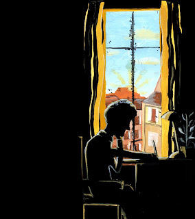
One of my most successful images so far, is this silhouetted image of Calvino at his writing desk. I really like the composition and the use of colours to some extent, and think that it shows a sense of him being deep in thought. I used reference material to recreate outside the window, which is based on his town of San Rema. In terms of using this image, I intend to create some of my sting based around it, as it really sums up how I see Calvino. However, I feel the image needs refining alot more, and i would like to develop it alot using more simplistic shapes and textures. I really like the textures that I created on top of the gouache, just by scratching into it. Something that I will investigate further.


In terms of colour I feel that I am drawn towards warmer tones when thinking about my author and his work, e.g Oranges, ochre and browns. It might be worth using a different colour palette to see if a completely different effect is created. It would be interesting to see how my images are interpreted. 

About The Author: Visual Journal Intro

To introduce us to drawing speculatively, we were given a task to illustrate an opinion of our chosen authors in different ways. Firstly we explored font, where I have written his name in a charming yet almost careless manner. I wanted to highlight his genius and his rustic italian background. I also wanted to make reference to his notes in which he sculpts his plots. 

We were also given the task of making an abstract mark that describes our author. As shown above, I created a very colourful, swirly mess using pencil crayon, attempting to illustrate his creative flare and knack for fabricating amazing amounts of information for his stories (e.g invisible cities). 


In this section we were asked to draw a reoccurring motif from a chosen piece of writing. I chose the idea of a a city, and illustrated it using warm tones, and sketchy markings because of the way that his cities are often full of wonder and imagination. In opposition to that, we were challenged to draw the same motif in a different way using different media and colours etc. I went for a completely new approach using ink, to draw a dull, boring and unpicturesque city scape, which was the complete opposite way of how I could interpret it. 

I found this task extremely useful in getting to grips with how to explore my author visually, and thinking outside the box. I thought the opposite-motif drawing was really useful in terms of opening up my mind to thinking outside the box and thinking less literally. 


About The Author: Youtube research

Interview with Gore Vidal on Italo Calvino


Really interesting interview, that outlines how Calvino was received in the world of literature. 

- The Ants took literary world by storm 
- Everybody who knew Calvino admired him
- Calvino was not at all Political
- Where Calvino was, there was literature
- Each language had their own character in his writing, he shaped their language
- Italo looked at everything carefully, figuring out why things worked (inquisitive nature, inherited from Botanist parents/upbringing?)
- Learnt agricultural skills from parents, who were scientists. Had a great knowledge of flora in his local area. 

Bookmark Interview with Italo Calvino


This interview was really useful to me in terms of understanding who Calvino was as a person, and the environment in which he grew up, and does his work. 

- If on a winter's night a traveller - from page one the reader is aware that something strange is happening. A novel that keeps starting?
- Unmistakeable tone, changes from one book to the next. 
- Each of his works are "untranslatable" (Relating back to idea of each language having their own character)
- "Calvino was a juggler, an alchemist"
- Calvino grew up in San Ramo, Italy, and he had little taste for it's seafront vulgarity. 


Stills from the documentary that have inspired me visually

About The Author: Sketchbook Exploration


-  Didn't really connect with the author, and didn't get across his intense highly visual and descriptive plots. 
- Found self drawing boring, repetitive imagery (from the novel)
- Didn't explore media that well, apart from pencil crayons and markers. 
- a lot of pencil work, however, received feedback in crit saying that it was very strong. 
- A lot of drawing from imagination which I found quite difficult (as an illustrator that is very poor i know), but I felt a lot more comfortable drawing from reference. 

About The Author: Chosen Author + 25 Pieces Of Information

Italo-Calvino.jpg


Italo Calvino 1923-1985


- An italian author, with a 'deceptively simple style of writing'.
- If on a winters night a traveler' well known for it's iconic narrative style which engages with the reader in a subtle yet genius way.
- 'Invisible Cities' emphasises Calvino's intensely descriptive nature, and interest in the surreal/dreams. Massively imaginative, and an engaging story. 
- His works are often constructed with great innovation, for example, chapters of a story that can be read in any order. 
Chosen Work
Italo Calvino - Invisible Cities

The story of Marco Polo's voyage from Venice to Cathay, including descriptions of many fictionalised cities.

25 Pieces Of Information

5 Quotes

- "Cities, like dreas, are made of desires and fears, even if the thread of their discourse is secret, their rules are absurd, their perspectives deceitful, and everything conceals something else."
- "Memories images, once they are fixed in words are erased"
- "It has neither name or place… What is imagined as possible… They decided to build a city like it was in the dream…"
- "the travellers past changes according to the route he has followed."
- “Futures not achieved are only branches of the past: dead branches.” 

5 Motifs

- Models of cities in glass globes
- Hourglass
- Ostrich Plumes
- Stories
- Boats

5 Characters

- Explorer, Marco Polo - Symbolic of wonder, dreams, excitement 
- Emperor, Kublai Khan - Symbolic of Power, wealth 

*It is argued that many of the cities described in the story are characters*

There are 50 cities in total, each falling under one of these categories:

- Cities & Memory
- Cities & Desire
- Cities & Signs
- Thin Cities
- Trading Cities
- Cities & Eyes
- Cities & Names
- Cities & the Dead
- Cities & the Sky
- Continuous Cities
- Hidden Cities


- Octavia, The spiderweb city - "This is the foundation of the city: a net which serves as passage and as support. All the rest, instead of rising up, is hung below: rope ladders, hammocks, houses made like sacks, clothes hangers, terraces like gondolas, skins of water, gas jets, spits, baskets on strings, dumb-waiters, showers, trapezes and rings for children’s games, cable cars, chandeliers, pots with trailing plants. Suspended over the abyss, the life of Octavia’s inhabitants is less uncertain than in other cities. They know the net will last only so long."
- Sophronia, The Thin City - "The city of Sophronia is made up of two half-cities. In one there is a great roller coaster with its steep humps, the carousel with its chain spokes, the Ferris wheel of spinning cages, the death-ride with the crouching motorcyclists, the big top with the clump of trapezes hanging in the middle. The other half-city is of stone and marble and cement, with the bank, the factories, the palaces, the slaughterhouse, the school, and all the rest. One of the half-cities is permanent, the other is temporary, and when the period of its sojourn is over, they uproot it, dismantle it, and take it off, transplanting it to the vacant lots of another half-city."

5 Pieces of Information about the author

- Italo Calvino was born on October 15, 1923 in Cuba.
His parents were botanists. 
- Raised in Italy. 
- The influences of the lush greenery, vegetation and flora Calvino grew up in are often reflected in his writings. 
- He and his family resided in a country house at Pinetta Rocca Mare near the Riviera.

About The Author: (Summer Research - 3 Authors)

Initial Thoughts

When first faced with this brief, I was slightly overwhelmed at the amount of authors I did not recognise. Admittedly I am not a huge reader, so having to engage with a completely new text was going to be a challenge for me. I was familiar with a few of the names from studying english literature, for example Harper Lee and William Shakespeare, however when choosing an author I wanted to have a focus on forming my own opinions about my author from scratch. A recommended author that really caught my attention was Italo Calvino - Invisible Cities and it's visually rich way of telling the story. Others that I felt slightly drawn to were Angela Carter, and Edgar Allen Poem, mainly because of their gothic themes which I felt would be interesting to convey visually, using different medias to experiment with how atmosphere is created. 


Author Research

Italo Calvino


Invisible Cities book cover by Caitlin Russell 

Italo Calvino (1923-1985) was an Italian journalist and writer of short stories and novels. He is well known for his innovative styles of writing, for example, complex yet accessible plots, and his intense creativity when using description in his work, for example in his novel Invisible Cities. I had never heard of this author before starting the project, which seems strange now as I have come to learn that he is a very world famous novelist. It was Fred's recommendation of 'visually rich short stories' that drew me to this particular text, as I feel that it gives a lot of space for exploration of media and concepts. The fact that the text is very metaphor based, including hundreds of iconic quotes, has really inspired me to look deeper into who Calvino is, and more of his work. 

"A classic is a book that has never finished saying what it has to say."

Angela Carter 


Angela Carter (1940-1992), was an English novelist and journalist, known for her feministmagical realism, and picaresque works (referring to prose fiction which depicts the adventures of a roguish hero of low social class who lives by his wits in a corrupt society). She has been ranked one of Britain's best writers since 1945, having had her work launched into academic and critical discussion upon her untimely death to lung cancer in 1992. Having studied gcse's in english language and literature, I have stumbled across Angela Carter and had a preconceived idea of her gothic and somewhat controversial themes. However I have not read any of her works. Upon researching her, it is clear that the stories she creates, once again, create a lot of opportunity for exciting visuals, however I have already come across thousands of artworks relating to this and feel that it would be something of a struggle to illustrate a completely new and original take on it. 


"Comedy is tragedy that happens to other people."


Edgar Allen Poe


Edgar Allan Poe (1809 - 1849) was an American author, poet, editor, and literary critic, who's work, like Angela Carter is very centred around gothic themes. He is best known for his literary works such as The Tell-Tale Heart,” “The Raven,” and “The Fall of the House of Usher.” He is known as the inventor of the modern detective story and an innovator of the science fiction genre. Poe's reputation today is based mainly on his tales of terror and haunting poetry lyrics. I personally don't have much interest in Poe's work, I just felt that himself as an individual would be interesting to explore visually. From researching, I have to come find that his life was filled with bizarre and suspicious events that caused him to write the way he did. His death also is shrouded in conspiracy which I think is really interesting.  

"Deep into that darkness peering, long I stood there, wondering, fearing, doubting, dreaming dreams no mortal ever dared to dream before."