Tuesday 17 March 2015

Visual Language: End Of Module Evaluation

1. Which practical skills and methodologies have you developed within this module and how effectively do you think you are employing them within your own practice?

In this module, I have developed a massive understanding of some practical skills and received a feel to essentially what illustration is. I feel that this module has allowed me to experiment and explore a range of methodologies that I would not usually have tried. I particularly enjoyed SB2 and found it really useful in terms of learning about composition as a whole, something that when making pictures, I would not instantly think about. It has really opened my eyes to the importance of composition and has really effected the way I make pictures. My understanding of roughs and scamps has also developed greatly and can now say that I am able to use them effectively. However I do feel like I need to create roughs more exhaustively, which is something I will definitely work on.


2. Which principles/ theories of image making have you found most valuable during this module and how effectively do you think you are employing these within your own practice?

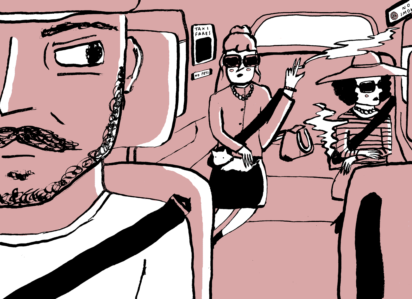
My favourite brief from this module was the 3D and lens brief, which I felt like I really got into. Although the process of creating 3D shapes was quite daunting, I really enjoyed using my photography skills and trying something new. I have not used this process in my work since this task, however I feel that it is a really complex process and would need a larger time scale to create an effective piece of work. Another session that I found really valuable was the Line Of Sight session and Transport task. I feel like I created one of my favourite images in this session, mainly because of the way that I was able to construct it using the methodologies that I had previously learnt.


3. What strengths can you identify within your Visual Language submission, how have you capitalised on these?

After the session based around 'Line', I felt really inspired to create pictures using various line qualities. I had never recognised the importance of line quality and gesture, which, after this session was something that I really focused on. Because of the experimental nature of this task, I was able to find new ways of drawing, for example the use of dip pen which I have not stopped experimenting with since, and really aided my work in Visual Narratives.


4. What areas for development can you identify within your Visual Language submission and how will you address these in the future?

One of the main weaknesses I can identify from this module would be my lack of refinement and development, at least in the early stages. Because of the way that this module was structured, I felt like I was doing the task and not revisiting it until a week after, which was not effective in terms of developing my artwork. Another weakness, I would say is my Screen Print submission. Overall I was just really disappointed with this piece, because of it's boring artwork and poor use of colour, which I feel was due to inadequate preparation and poor time management,


5. In what way has this module informed how you deconstruct and analyse artwork (whether your own or that of contemporary practitioners)?

This module has been so useful in teaching me the different elements that make up a picture. When analysing a picture, I feel very confident in talking about it in depth, and how certain effects and tone of voice are created through different visual elements. Aswell as contemporary practitioners, it's also great to have a checklist of elements that when making pictures, I can consider and create in my own work.


Visual Language: Screen Print

The final task in our Visual Language module was a screen print, based on 'Doing Something Good'. I was really inspired by Matt Taylors prints and his use of colour. Initially I started roughs, and generating ideas for my subject, which found this quite difficult as I wanted to create something that would have interesting imagery.


Some photos I took of the process:


I found the process really easy, considering it was my second time doing screen print. Although there was a lot of waiting around involved, it was fun, and it's always a good feelings generating your own prints. 

Final Print; Coffee & Cigarettes

My final image I was really disappointed with. I think that when creating roughs, I was focusing more on how it would work as a 2 colour print, and not enough on the actual image itself. I think that the orange fill is really overpowering. My original intention was to create the image in Illustrator and make a slick, almost icon-like image, however due to time and work load I was unable to do so, which I really regret. One aspect of the image that I do like is the variation in line quality and think that it creates an interesting tone of voice in the image. 

Over the last module I feel that Visual Language has really helped me to develop as an illustrator, and I do not think that this image demonstrates how much I have developed, hence my disappointment. 


Monday 16 March 2015

Visual Language: Line Of Sight


This image by Tom Cole, I felt, was a really good example of Line Of sight in an image. I feel that mainly the shape of the clouds act as arrows, creating a pointing effect towards the other side of the image. The use of a bright white path also leading off into the distance adds to this effect. I also feel that the change in colour creates this effect, as there is an almost gradient created, darkest being the object closest to us. I really love this image because of it's unique use of colour and think that the use of texture is lovely. 

For our task, we had to create an image that employs a Line Of Sight, based around the idea of Transport. My image was based on a taxi ride, because I felt that the layout of car would contribute to an interesting line of sight. I initially experimented with roughs; 


My roughs weren't as exhaustive as I'd have liked, however I already had quite a clear picture of the composition of my image. I think that they helped me in terms of getting my head around the layout of a car however. 


I then drew my image out using a Dip Pen and ink, being really experimental with my lines. I really enjoyed creating my initial image and love the effect that dip pens create, despite them being quite messy. I then coloured my image digitally in photoshop, using a colour palette of black, white and pink. 


In terms of creating a Line Of Sight, I took inspiration from Tom Cole's image, whereby I wanted to plant small tiny details that are pointed out using the line of sight technique. For example, in my image, there is a small 'No Smoking' sign in the corner of the image, that is hopefully highlighted by the smoke acting as an arrow. I also employed this effect when drawing the seat belts, making them arrow like and pointing them in the direction of the sign. 


I really enjoyed this task and feel that line of sight is a really valuable tool to use when making pictures, which I will definitely be including in my work in the future. 


Visual Language: Viewpoint & Depth

For this task, my goal was to create the illusion of distance between 3 figures. Initially, I created roughs employing a foreground, midground and background. When creating roughs I feel I really exhausted my image, which truthfully I have never been very good at. I got really into creating different compositions and felt that I was at a stage where I knew what looked out of place etc. 


For my final image, I chose to base it on a rough that I thought was the most dynamic, creating more of a sense of believability. I chose not to use overlapping in my image, because although it adds to the 3D effect, I felt that my figures were too far away and would look fake. In terms of media, I was challenged to only use pencil crayon; I'm not sure about the use of the crayon as I feel like I used it really boldly to create more drama in my image, and I don't think that crayon is an effective way of achieving this. I feel that I was quite experimental with colour however, adding small flecks of green and purple. I think this adds to the image, and once again creates a dramatic and striking effect. 


Overall I am quite pleased with my final image. I think that I used roughs really successfully to achieve a dynamic composition. If I were to do it again, I would change the use of media to something more appropriate like gouache. 

Visual Language: Frame

This week I focused on frame, and how the cropping of an image can be crucial in terms of composition and placing importance on certain aspects. In this task, we had to create an image composed of an Elephant, a Butterfly and myself, focusing on composition, scale and frame. I started with some roughs;


There were so many ways I could show the 3 aspects, as shown in my roughs. I found it really difficult to decide which one was most effective. When deciding, I knew I wanted a really dynamic unique composition that displayed the 3 in an unusual way. My final composition is very dynamic, with really unique framing. I attempted to use the rule of thirds guide so that my composition was balanced. Overall I think the compositional elements of this piece are really interesting. However, I do not think that the imagery looks effective atall. 


Visual Language: Composition

For this task, I focused on Compositional elements and how experimental roughs can be used effectively to create a successful image. I felt I was quite exhaustive with this task and created a number of roughs, each demonstrating principles described in the handout we received. 


I really enjoyed creating this piece, because of its amount of detail. I sometimes find myself getting lost in a piece, adding small insignificant details, and I think that it often shows in terms of craft. The compositional elements of this piece are effective, in my opinion. I have used the notions of foreground, mid ground and background and created a really dynamic image. I like how the image is more engaging with the man's head in the foreground, as I feel that you can see the facial expression more, developing a character. 


In terms of the final image, I think that the composition is really effective. However, I am not certain about the use of colour? I took inspiration from Drew Millward's screen prints and attempted to experiment with his style, however, I think that my image has ended up looking messy and confusing. I do really like the colour scheme though. 

Visual Language: 3D & Lens

I found this task really challenging. The idea of creating 3D objects to photograph is really interesting to me as I have loved model making in the past. From looking at the examples shown in the briefing, I think that the use of 3D objects in a photograph do give a real depth to the image, especially when you can see how natural shadows/lighting falls on the shape.


For my mutation I chose to have the power of controlling the weather (inspired by a lot of horrible weather over christmas!). To create the models, I cut various shapes out of coloured card, also researching nets on the internet for unusual shapes. In the end I came to the conclusion that If I wanted my image to be understood, I would have to use cliches, and stuck to the classic shapes of weather icons. I really enjoyed constructing the shapes, although some were very fiddly, and just seeing 3D art work is really interesting. 

I am really pleased with my final image. I think that the composition of the image is really effective, created using the rule of thirds technique, and I think that my 3D shapes look awesome and are instantly understood. I also like the minimal splash of colour that the shapes bring to the image. My only regret is not being more adventurous and making more icons, as I feel that they may have improved the composition slightly more. 

Visual Language: Collage & Ephemera

I feel that I really struggled with this task; I have never been very interested in collage as I don't like the idea of using other people's work in my own, however due to my time limit I had no other choice than to scan books. My goal was to create a poster relating to the theme of horror, advertising an event. 


Here are some examples of the images I used in my collage, from a range of sources. 

Here was my final piece. When creating it I tried to be very selective of my images, in order to aid the composition. I tried to look for images of 2 figures together, that could imply dancing, and perhaps create humor. I then used photoshop to paste it all together, adding overlaid colored shapes to split up and organise the composition. 
________________________________________________

Some of the feedback I got for my final piece was really understandable; 

- Not enough of ~you~ in it.
- Works well as a poster, but as an Illustration it is quite boring. 

I completely agreed with my feedback as I found it really difficult to give the work a visual signature when I was using other peoples images, and I just find collage quite tedious in general. 
However I was recently inspired by Miles Donovan, and his used of layered, almost 3D looking images. So I experimented slightly with this technique to see if my poster looked better. 


I think that the use of the 3D effect makes it look slightly more unique, however does not improve it greatly. From this task, I have learnt that collage is not for me, however, if I were to use it in the future I would be alot more experimental with analogue media.