Tuesday 28 February 2017

Cosmetics Brief: Pattern Development


Collection of visually inspiring patterns I found on pinterest, I like the sense of movement within these but also the textural quality.  I don't feel that stand alone pattern design like this relates to my practice alot, however product design definitely does, so I feel I want to take inspiration from these examples to create an aesthetically effective pattern that I can start applying to product and packaging design.

-
-


\Mockups of my pattern designs with logos to see how effective they are in terms of branding.
Having created a set of surface pattern outcomes, I began applying the logo to create a fuller sense of our brand image.


Sunday 26 February 2017

Cosmetics Brief: Picadilly Vaults


Another example of product and packaging that I find to be really visually inspiring, but also quite relevant to our concept of nautical/ocean themed cosmetics. I think this design is really stunning and has a dark mysterious element to it whilst stil conveying Luxury through the use of dark colours and gold foil. I feel that the color scheme of this is really effective and appropriate, which I would like to take inspiration from when creating patterns. 

Saturday 25 February 2017

Cosmetics Brief: Pattern Experiments


One of my responsibilities for this project is to create a collection of surface patterns that will decorate the packaging. To do this I began to explore mark making using a collection of custom brushes, with a focus on creating rock like textures and patterns. Because of the abstract, expressive and experimental nature of this task, I found it quite difficult (and a bit unrewarding) as I'm not a pattern maker, and the outcome is purely for decorative purposes, not communicative, so it just didn't seem like I had much to work towards. I do not think that pattern design relates to my practice whatsoever, and this outcome is going to be very abstract. I am passionate about creating an effective pattern in order to decorate the box, however when developing my own, i'm unsure how to define what makes a succcesful pattern? What skill set does this demonstrate?

However, throughout my process, I was able to pick out elements that I thought were visually effective and which were not, enabling me to develop a design through refinement. I think the patterns i've started to generate here are effective in conveying an authentic textural quality that we decided would work best, however it still just feels a bit pointless because of the aimless mark-making I underwent to create random samples. I feel that a concept is needed here.

Colour


For my next set of pattern developments, I will have a focus on building the visuals of the box based on the visual colour schemes and textures of shells - dark and unnoticable, but when opened an explosion of pearlised colour and pattern inside (further reflecting the oceanic theme). I wanted to use this concept as it reflects the mysterious nature of the story of atlantis, and an element of mystery was key to making this design stand out. 

Cosmetics Brief: Visual Inspiration + Sketchbook


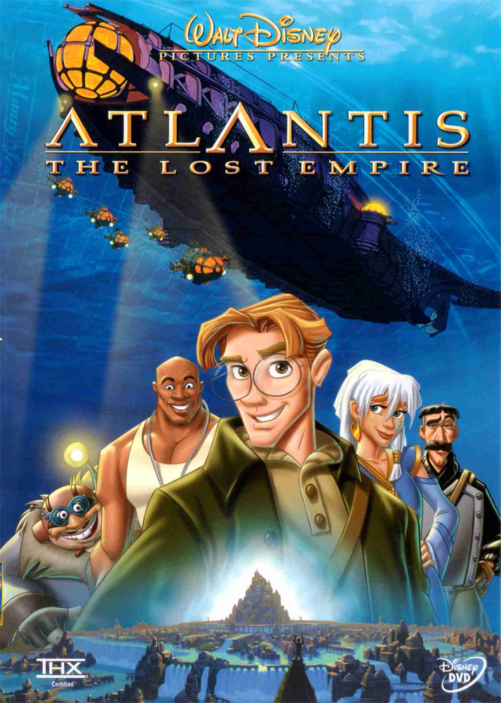
I've started collecting some visual inspiration for our Cosmetics Box in terms of design and pattern. I started with the disney film, which I find to be really exciting conceptually. I love the idea of the Lost Tribe and their tribal markings etc which is something I'd like to take forward into my surface pattern design, creating something that looks authentic and ancient. Some examples I found:


I also had the idea of using fish skeletons, to reference the concept of something being lost under the sea, and I think it could look quite elegant. There's something really nice and fragile about fish skeletons which could give the brand a soft but edgey appearance.

I feel that with the project we're attempting to create a luxury brand and I have identified nautical themes to be very trendy at the moment. 


Here I tried creating some patterns using shapes(that look quite tribal) and the motif of the fish skeleton. I quite like this image. although I've never really made a repeat pattern before so I'm a bit unsure where to start. I think I just want to experiment with mark making and go from there, as I think a texturally heavy design would effectively relate to surfaces of rocks etc at the bottom of the sea.

Friday 24 February 2017

Cosmetics Brief: Initial Sketchbook


After having gathered information about our themes and context,  I began visually exploring the ideas of ancient ruins under the sea, and sea creatures etc. I'm not sure what these images could be developed into yet but I felt this was a good way to start creating visuals.

I particularly like the motif of the fish skeleton, which I think metaphorically relates to the story of Atlantis, and something being  lost under the sea. Also the idea of skulls/reference to death has quite a romantic and edgy feel to it which could look visually quite striking. 

Cosmetics Brief: PLATO / Name and Brand Identity Questionnaire


So this is the logo, designed and developed by Amelia for our brand that will be called 'Plato' Cosmetics. We chose this name because not only does it sound effective, but it provides context for the Atlantis themed products. From our research we found that in his writing, Plato the philosopher, features the lost city in his writing 'Timaeus' and 'Critias', and he is what many believes to be the inventor of the mythical city. 

I'm really happy with how the logo design turned out and think its really elegant, cleverly using the cross-bar of the A to make reference to the sea. I'm excited to start applying this to products, and now we've got a clearer sense of our brand identity I can start making relevant surface designs. 

We also found this questionnaire online that helps define the aims of a business, so we decided to make up the answers for it so that we would have a better knowledge of what the aim of the identity and packaging was and who the target audience was. 

General Background.

1.What is your company name?
Plato Cosmetics.

2. How long has your company been established?
2016.

3. Can you describe your business?
The business is in the cosmetics industry, we sell vegan products that create a utopian experience.

4. Why was your company started - what was the motivation?
The company was started to bring something new to the market; we want to create a utopian experience, whilst simultaneously looking after our planet.

5. If you had to describe your business in one word, what would it be and why?
Environmentally-friendly.

6. Who are your main competitors?
Lush, Dove, Nivea etc.

7. What sets your company apart from the competition?
Every product sold will donate money towards looking after the planet. Every product is vegan and uses only natural ingredients. Our company will also be a subscription service instead of a shop, meaning repeat customers will be a definite and each subscription will be tailored to the specific customer.

8. How do your competitors market themselves?
Vegan, Feminist

9. What service do you provide?
A subscription service for relaxing and taking care of your body/skin.

10. What are the long-term goals of the company?
Ideally, within 5 years there will have been multiple pop up shops and the shops would run alongside the website. Plato will be more popular than Lush.

Target Audience.

1. Who is the primary target audience?
The modern person who looks after themselves, at no cost of the environment.

2. What is the target audience's age group?
16 - 40 year olds.

3. Are they mainly male or female?
Both, the products will be gender-neutral.

4. What is the average income of your target audience?
£25,000+ a year

5. Are they any new markets you'd like to break into? What and why?
After the company has been running for a couple of months, pop up shops will begin. The company will develop to run both as a subscription service, but also within retail.

6. If your customers were to describe your company, what would it be?
The closest thing to utopia on earth.

7. How do most of your customers find out about your company?
Social media promotion, through existing customers.

About the branding.

1. What are the values of your company?
We believe in vegan products, and donating to charity. We believe in a world without global warming, and therefore donate money from every product to help reverse the effects, whether that be for installing solar panels or wind turbines.

2. What do you want the logo to accomplish?
The branding will need to show class and appeal to a high-end market. It will need to appeal to both a younger demographic and a middle aged demographic.

3. What three attributed would you like your target audience to think of when they look at the branding?
luxury, originality, environmentally-friendly

4. Traditional or modern?
Traditional - to represent the story of Atlantis.

5. Friendly or corporate?
Friendly.

6. High-end or cost-effective?
High-end feel, but products will be cost effective. Trick question.

Design Preference.

1. Where will the logo mainly be used? Print, web, etc.
Firstly on web where the customers would subscribe, but then it will also be on the packaging.

2. In your opinion, what defines a successful logo?
Minimal, clean, legible, original and recognisable.

Thursday 23 February 2017

Product Design Brief: Initial Ideas + Existing Products

To start the ball rolling, we came up with a list of qualities/ethos'/campaigns that can be seen in existing products, with possible directions we could explore. 
We decided to make a note of trends, marketing techniques, target audiences, and ethos' and ideologies that can be see in existing brands. We also identified the theme of mythology as something we would like to explore visually and conceptually when creating our product. We thought that mythology would be a good path for us to explore because of how symbolic the stories are, and the lessons that lie within each myth, which could be adapted into some brand values for our outcome. 

We wanted to get an idea of a direction before writing the brief, so that it could be as concise as possible. We have both decided to go away from this first meeting with a pathway to research, in preparation for our next one. 

Cosmetics Brief; Contextual Research

We've decided to take forward the focus of Atlantis, because at this moment in time it seems like such a strong idea; we're using this theme to answer the brief because of how Atlantis was lost underwater, which links directly with global warming and rising sea levels. We're both really excited about this, and think that it's a really well rounded concept for our campaign/products. Also I think there's alot of scope for narrative, which in branding, is an effective tool, as seen in the John Lewis adverts, which I think will really benefit the campaign element of this project. 
Atlantis - What/why/who/when/where?
  • Atlantis is a fictional island mentioned in  Plato's Timaeus and Critias.
  • In the story, Athens repels the Atlantean attack unlike any other nation of the known world, supposedly giving testament to the superiority of Plato's concept of a state. At the end of the story, Atlantis eventually falls out of favor with the gods and submerges into the Atlantic Ocean.
  • Some ancient writers viewed Atlantis as fiction; others believed it to be real. The philosopher Crantor, a student of Plato's student Xenocrates, is often cited as an example of a writer who thought the story to be historical fact.
  • The story conjures up mysterious images of a lost city underwater, and has also been linked with elements of folklore, for example mermaids.
  • The Merbeings and Greece (https://exemplore.com/cryptids/Mermaid-Origins-Lemuria-and-Atlantis)


After the fall of Atlantis, the refugees spread out all over the world and took it upon themselves to start new lives and new civilizations. One of those civilizations would give rise to an ancient and powerful country now known as Greece. These refugees might have also included the race of mer-people and various "shapeshifters", if you will. One type of shapeshifter that is prevalent in Greek legends is the Siren. The Sirens are very often depicted as beautiful mermaids that are able to lure sailors to their deaths by the mere sound of their lovely voices; however, in Homer's Odyssey these Sirens were actually said to be women that could shapeshift into birds. Be the Sirens fish or birds, this is synonymous with the beliefs of shapeshifters inhabiting the once-beautiful Lemuria and once-powerful Atlantis.
  • In one cataclysmic night, the gods sent a battalion of fire and earthquakes so intense that the Utopian kingdom of Atlantis sank deep into the ocean, never to be found again.
A Mermaid by John William Waterhouse         
http://showstudio.com/project/platos_atlantis/catwalk_film

Thoughts


From my research, I have found that the story of Atlantis is one that is iconic, with so many fascinating and mysterious concepts. I really love the element of mystery within the story which is an aspect we have identified as something that could inform the concept of our product design. I think that the idea of mermaids could be something to explore further, however I feel that it would have to be done tasetfully as the concept is in danger of becoming a bit cliche and cheesy (and it's probably been done before).

Cosmetics Brief: Market Research

A range of packaging and design outcomes that we could possibly take visual inspiration from; Each of the designs is considered to be a 'luxury' product, which is reflected by it's well designed concept and highly developed packaging that uses materials like leather and embossed card - Attention to detail is impeccable. If the packaging is nice, it could encourage users to share photos on instagram etc?

To make our brand stand out from other cosmetic companies, we decided to incorporate the fact that the company would be based online, similar to graze. The business plan of graze is really crucial and we would base our own business model on theirs. We would start our business online and then after it becomes a hit we would then incorporate products into stores. Graze is really great and was revolutionary for healthy snacks; we believe Plato Cosmetics could be the same but for Cosmetics instead of food.

We also looked at Not Another Bill. This is a website we found through social media, and is a really unique subscription service, with a memorable brand name. The idea is that you would be sent a product once a month so that you have something to look forward to instead of receiving bills in the post. Our cosmetic company would definitely work in a similar style to  Not Another Bill; it's a very high-end brand and the website is beautifully designed, easy to navigate and appeals to lots of different people.


Collaboration: Cosmetics Brief - The Brief

After looking through the D&AD and YCN briefs, me and my collaborative partner Amelia Bramwell (Graphic Design) both reached the conclusion that none of the briefs really appealed to us, and would not give us the scope to work harmoniously, using both our skill sets in an equal way - In light of this, we decided to create our own brief based on our own interests and goals in Branding and Packaging design. Branding and Packaging is something that I haven't explored massively, but something that I would prefer to have a lot more of in my portfolio, as I do enjoy these projects and they are another pathway in commercial design that I would like to show I can do.  

After brain storming we came up with a basic starting brief that we could adapt, but try and stick to as much as possible. 


The Brief

Create and design the branding and packaging as part of a marketing campaign for a fictitious cosmetic company, that promotes awareness of a global issue. 


Background and Considerations

Existing brands, like Lush cosmetics and Dove, use their brand ethos as a marketing tool to engage with their target audience through charitable campaigns. What image does this create of a brand? 

Global issues like deforestation and global warming, for example, are causes that should be considered when making decisions about materials, products and distribution. How will your outcomes be in keeping with your brands ethos?
Target Audience

Men and Women, Ages 16-40
 The modern person who looks after themselves, at no cost of the environment. 

Deliverables

Branding / Packaging
Multi platform Campaign

Stratstone: Our work featured on the Stratstone Website!

http://www.stratstoneharrogatemini.co.uk/about/news/mini-countryman-launch/


It was exciting to see a picture of mine and Joe's outcomes on the stratstone website today! Not massively overwhelmed at the coverage it got but I think it shows our engagement with the industry and it's good to see that we're getting somewhere in terms of getting our work out into the public. My aim for Extended Practice has been to work commercially so I'm glad we've got this so far, with hopefully more to come!

Monday 20 February 2017

Out Of Order: GIF Development

After experimenting with animation in my To Kill A Mockingbird cover, I felt really motivated to try it on a load of different images, and I think it's a great way to show variety in my portfolio. 

I'm currently still trying to get my head around basic gif animation so I feel like the timings are a bit off for (number1), but I'm really happy with the smoking cigarette and just love how it adds another dimension to my image, and another element of communication.


I could definitely see these animated images being suitable for online editorial content for articles, which is a pathway I'm really starting to consider for my FMP. 

I feel like this development through animation makes my images alot more relevent and appropriate to screen based platforms, which could be utilised through multi platform marketing campaigns - a way to make my images commercial. 

Saturday 18 February 2017

Illustration Friday/Typography: Stomp


This is another response to a chosen theme on Illustration Friday, 'Stomp'. This was actually quite a difficult one, as I tried to think outside the box of a footprint. Instead I wanted to create a 3D and layered feel, making the negative space appear to be bearing down on the grass. I don't think this directly communicates the aggression of the word 'stomp' so ideally could do with being developed. However as this is just a personal project, I don't want to spend much time dwelling over it as it was an other oppurtunity to push the 3D/rendering aesthetic that i've recently been experimenting with.

Friday 17 February 2017

Out Of Order - Part 2?

So I really enjoyed creating my image for Out Of Order, so much that I wanted to create more images based on this environment. There's something that really appeals to me in terms of creating atmosphere and lighting, which really lends itself to the environment of a motel. In this piece I wanted to create a kind of Part 2 to my original image, develop the narrative a bit more?


I created some compositions based on the female character looking outwards through the window, again with harsh neon lighting beaming down on to her. Once again I took alot of inspiration from Film Noir, focusing heavily on shadows, negative space and silhouettes, in order to create a powerful atmosphere.


So this is my final image in this mini series I've created, based around the theme of adultery. I think it's maintained the boldness and suspense of the first image, but just adding another dimension to the story. In terms of creating commercial use for these images, I merely created them as one off images without a purpose, other than to be sold in the show. However, I think this image in particular could lend itself to editorial or record sleeve design like secret 7", which would be a very commercial purpose for it. I just think, like in my 1 a week illustrated type brief, that these images are good for just remaining active on social media and getting my work out into the public view. 

Thursday 16 February 2017

Stratstone: Development


Another logo/image development with the Mini Logo and the images from the brief. I'm really enjoying this concept and think that it looks like it could work on a commercial scale. I think this image really communicates outdoors aswell as the car brand = mini countryman. 

An example of how my developed logo image could be used on marketing material for the launch:

Monday 13 February 2017

Out Of Order - Final Print

This is my final response to the Out Of Order brief, I think it'll be called something like 'The Motel'. I really played on the idea of bold colourful neon lighting, and harsh dramatic shadows, taking huge inspiration from 'Film Noir'. I played around with alot of colours for the lights and found this to be the perfect shade for the atmosphere I was attempting to create. I've never used colour this boldly before, so I feel like this will definitely be an effective portfolio piece, demonstrating that I can use colour well.  


To communicate 'Out of order', I attempted to make the sign look like some of the letters were broken which I wanted to be the main focus of the composition; and then upon closer inspection notice the couple in the corner who are acting -out of order- and being a bit naughty at the motel. 

In terms of visual quality I'm really happy with how the image turned out and think it's a bold, atmospheric window into a story. I particularly like the use of leading lines to the centre of the image, which I feel has an interesting effect on the way the viewer would read the image. 

Saturday 11 February 2017

Out Of Order: Initial Sketching + Idea Development


Reference material from Google Images, bold, shadowy, bright neon lights - atmospheric, hints at something a bit mysterious/seedy/naughty? My concept will be based on the idea of a broken blinking neon light. 


Mockups/ Composition/ Line of sight 

Adding double meaning to Out of Order -

I also had the idea of adding a couple kissing in a doorway to give my image a bit more depth - I wanted to create a narrative of 2 people that were being adulterous to their partners, and meeting up in a seedy motel to cheat. I then feel like this adds more depth in terms of answering the brief, cheating could be considered 'out of order' - out of order marriage, or out of order in the sense of behaving in a wrong way?

Film Noir


In my head my image is going to end up looking very film noir. I intend to play on the harsh lighting of neon lights, that will cast bold and powerful shadows as seen in the images above. I love these images and find them extremely powerful and immersive in terms of creating atmosphere and suspense. I aim to take alot of inspiration from this genre when building my image. I also like the cinematic element which is something I've identified as a running theme throughout my previous work, I like making images from a particular dynamic view point. 

Out Of Order: Idea Development

After watching 'La La Land' I felt really inspired to start incorporating heavy lighting elements into my work, such as neon lights. I like the way they create bold colours in and around their environment and think using them would be a good way to start getting some bold colours/shadows into my work.


I then started to think about how I could use this starting point of neon lights to create something visual for the show. 

Bars, casinos, Las Vegas? Motels, classic american culture - All very bold and colourful
I feel like the whole idea of neon lights has quite direct connotations of something being 'out of order', like a faulty blinking sign outside a sleezy motel (very cliche but think it could make a really atmospheric image).

Stratstone: Poster Development

As stated in my 'overall experience' post, I feel that the images were too illustrative and overpowering to just be used as a mere backdrop for a campfire (which if we'd have known we could've made them a bit more subtle). 

However I decided to develop them and use them for posters advertising the launch, displaying more of a commercial use for the images, which I feel is more appropriate. I think these 2 images in particular really communicate an 'outdoors' feel which is what the mini countryman is all about, so I think using them for hypothetical posters is a successful way of developing them. I also feel that they'd be effective portfolio pieces displaying how our work could be used commercially. 


This development is my personal favourite as I really like the concept and love how it's like a window to the outdoors. I did struggle with the harsh black logo because I feel like it needed to be more subtle, however the deer in the foreground looked really out of place and shadowy against a a lighter colour. I took inspiration from the Llama park signs I created during summer, making things come out of frame in order to create a more immersive effect. If I get time i'd like to use this concept to develop the other images from the project and make some great pieces for my portfolio.

Friday 10 February 2017

Illustration Friday/Typography: Tea


This is my response to the chosen theme of 'Tea'. I think it's a pretty basic concept but something that i've managed to pull off quite well. Im really enjoying this brief at the moment as it's an oppurtunity to explore something different, communication in a different way. 

To create this image I used the airbrush tools on photoshop again, which, like in my previous response(Up), has a 3D rendered feel, displaying an ability to use shadow and lighting effectively in my image. This piece has elements that are definitely consistent within my current portfolio, including dynamic viewpoint and using shadow and light. 

I've decided to stick with the default typeface Futura for the rest of my outcomes in order to create a bit of consistency throughout this project, which I think should continue to make an effective body of responses to the Illustration Friday themes.