After having completed my Extended Practice module, I feel I have a much better sense of where my creative interests lie. I have identified projects that utilise a mixture of process, such as illustration and graphic design, or illustration and animation, to be the most rewarding offering a fully rounded and developed outcome, which are processes that I would like to explore after leaving Uni.
I will continue to work with St Wilfrids school and college in an attempt to generate a body of commercially informed and aware work, that will serve as part of a portfolio relevant to the design industry, which will aid my application for design jobs in agencies.
I feel that my ways of working have definitely developed since the start of Extended Practice, allowing me to gain a range of skills in Animation and Virtual Reality, which will allow me to continue to develop unique and innovative outcomes.

Monday 15 May 2017
Sunday 14 May 2017
Extended Practice: Summative Evaluation
My main intention for this module was to generate a wide range of responses that are appropriate to commercial illustration and design. I have identified a range of briefs, live and competitions, where the outcome would be appropriate to my intentions of creating an informed body of commercial work. Throughout the module I have consistently identified areas and contexts that I could apply my finalised outcomes to, using processes like animation to push them further, in order to create an innovative body of work that works across a range of platforms. I also feel that the briefs I have been responding to, have allowed me to create fully realised outcomes using graphic design processes to add finishing touches and present my work to a professional standard, for example book cover design. I feel that I have used this opportunity to really explore all relevant pathways, including product, app, web, logo, advertising, typography and book design, which will show versatility and skill in a varied and effective portfolio.
My favourite brief of the module was my Final Major Brief which saw me identify a problem using market research, and develop a solution to it in an innovative and professional way. I feel that this project was an embodiment of every process and genre I have explored throughout the module, demonstrating my ability to capitalise on successful elements and develop them. This module has helped to realise the areas that I enjoy working in, and the one’s I do not - for example, creating self indulgent outcomes with no function other than to be decorative, referring to pattern design and greetings cards. I have gained a better understanding of the technicalities of animation, which I can confidently now use to continue to develop my images, in order to keep my work relevant to technological advances.
I’ve gained alot of valuable experience in responding to briefs in a professional manner ensuring that my audience and function have been carefully considered. I have also become aware of the importance of testing processes before pursuing them, especially if they are technical, as I feel this has hindered a few of my outcomes, for example Virtual Reality tests. With elements like Virtual Reality, I feel I have demonstrated a commercial awareness around developing technologies like this, and identified ways that I can use in future to generate more immersive and interactive outcomes.
I have also gained alot more confidence in my ways of working, especially after being shortlisted for The Prize for Illustration 2017, and receiving some positive feedback from Ben Cox. I am confident that I have built a solid foundation of skills and knowledge, on which to build the rest of my creative career, hopefully working continuing to work in a commercial context.
Saturday 13 May 2017
FMP: Statement of Intent Reflection
Now that all of my projects have reached a visual outcome, I wanted to reflect on how successful this module has been in terms of reaching my goals.
What I wanted to achieve:
A portfolio of work that displays a range of qualities and processes that are appropriate for commercial application.
What I have achieved:
Animated Outcomes - I have utilised animation throughout the module to develop my images and make them appropriate for screen based platforms, which relates to the concept of creating a multi platform user experience, a tool that is often expected for marketing projects/advertising campaigns. I feel that as technology progresses, the need for animation and moving image will be even greater than it is now, so I want to show that I can adapt and create work in this way.
Graphic Outcomes - Displays visual skill and knowledge of layout and type, to be applied to across all disciplines.
Illustrative Outcomes - Demonstrates my ability to visually respond to a given subject in order to communicate or decorate.
Branding Outcomes - Demonstrates an ability to use graphic design processes to visualise a brands values/personality.
Product Design Outcomes - Demonstrates my ability to innovate, and design/render and propose a fully functional product. Also idea generation.
St Wilfrids: Time Plan
So unfrotunately I have not been in contact with Chris at St Wilfrids in order to achieve some form of resolution for the Extended Practice deadline. However as this brief will be ongoing until around the end of August, I have created a time plan to propose how I intend to reach a fully effective outcome.


Obviously because of the nature of this brief, I was unable to extremely concise, however I feel that from my experience so far, that I will be able to work quickly and proactively whenever needed .
Thursday 11 May 2017
FMP: Travillo Concept Proposal - Boards / Reflection
Concept Proposal Boards for my website/app, featuring my outcomes as illustrative examples.
On my boards I've aimed to create a professional standard of proposal of my product, using visual explanations, text and mockups.
Concept
a travel journalism platform that utilises visual and immersive techniques, in order to entertain and inform it's audience. My main goal for the product is to create journalism that people are excited to read, that is presented as a complete visual experience. I have identified visuals to be a key characteristic in this genre of journalism, as it helps it's audience to engage with the subject matter and visually explain it, aswell as creating an enticing aesthetic.
Audience
People with an interest in Travel Journalism
People with an interest in Art and Design, contemporary illustration and graphic design
Children - highly visual element relates to childrens book's. Visual explanations have been proved to help children to understand content more.

'Travel Journalism at it's best.'

'Over 100's of interactive & informative articles to choose from - Just pick a place and we'll take you there!'
'A unique visual experience with every article'

App design, proposing function and visual aesthetic.
Reflection
In terms of creating a believable and functional product, I think my boards are highly successful and do so in a professional and visually efficient way. I think I have used language effectively to create a friendly tone of voice for my brand, using a light colour scheme to communicate a light hearted and creative vibe.
FMP: Page Mockup
Starting to visualise my idea, in a way so that I could hypothetically propose a fully functional product for assessment.


(Still)Web page mockups showing the design and functionality of my product, featuring my logo design, and a deisged navigation bar. To create the layout I took inspiration from The New Yorker's full screen illustrated header, in order to create a fully immersive element (only mine is better cause it's animated).

Screen based web mockup, displaying immersive quality of full screen animation/header. I think this has been a good outcome in terms of giving my portfolio variation aswell, including aspects of logo design, web design, type layout, illustration and animation.
FMP: Spot Illustrations
In order to fully visualise my intentions for this project, I wanted to make an example of a fully functional web/app article that reflects my idea of immersive/interactive and entertaining journalism.
Aswell as creating an animated title image, I wanted to incorporate smaller editorial style images into my design, in order to fully utilise the possibilities of screen based platforms, and create a complete visually immersive experience for the viewer.
In-text spot illustrations/animations


Because of the list-type style of the article, I found it quite easy to assimilate the information and respond to it visually. This is my final outcome in response to 'Malang Tod' (Insects), using the visual clue of chopsticks as a way of incorporating this shocking food into a normal dining environment. Pictured above (left), is the process I undertook to animate the image, creating 3 frames in order to simulate a 'wiggling' effect. I wanted to create the same kind of illustrative quality so that the whole article has consistency, so I created this effect using the same harsh colour schemes and textural brushes.
Differently to my previous animated outcomes, I just used photoshop to add movement to this image which has resulted in a slightly jittery effect - although I feel the animation quality is lacking slightly, this way I was able to maintain a visual outcome with a consistent visual style that would've been lost if animated in After Effects. I think it communicates/illustrates the text perfectly in an effectively executed style so I'm happy with this outcome.


This was another outcome in response to 'Dancing Shrimp', the concept of eating live seafood that still moves on the plate. Once again quite an obvious outcome in response to the text, but communicates effectively non the less.
This animation was so much more complex than the previous response and was created using After effects. To create a looping animation I had to ensure that all movements were timed correctly in order for it to appear seamless. This process really challenged me in terms of overcoming technicalities, opening my eyes to how difficult animation can be, resulting in a total of 4 hours of tweaking the movements (and it's still not perfect). In order to create fully effective movements, I had to create seperate animations of looping wriggling shrimp, that I then uplaoded to after effects to move around.
In terms of visual quality I'm happy that once again I have created an image that appears consistent with my other responses to this article. I think I've used the negative space in the image quite innovatively in order to create the immersive/3D effect of the shrimp jumping out at the viewer.
FMP: Reflection So Far
Reflecting on what I've created so far, I'm really happy with my outcomes - Amazingly I feel that these outcomes are symbolic of everything that I have developed and adapted during extended practice. They are the embodiment of illustration, animation, graphic design, illustrated type, book design(kind of), and I think it's just amazing to see how everything has come together. I've found a way to push my way of working using text and animation, relating to "illustrative design", something that in PPP I identified as an area for exploration.


Relating back to my outlined Brief and how I proposed to produce title images and spot images for 3 articles - I feel that I may have to reconsider. As my idea has since developed into the creation of a brand/product, I feel that design work needs to take more priority in terms of conveying a fully rounded project that reflects my intentions, as opposed to creating a larger body of similar animated works. Ideally i'd liked to have had both, but I do not feel it is realistic at this moment in time.
As I have decided to propose an App/website/product, it got me thinking about ways that my images (above) could be applied to develop them further. As they were bespokely created in response to chosen articles I feel it would be difficult to apply them randomly to other products, however I think it exemplifies ways that moving image and type can be used effectively together in order to utilise screen based platforms, and create immersive editorial content.
Outcomes so far:


Relating back to my outlined Brief and how I proposed to produce title images and spot images for 3 articles - I feel that I may have to reconsider. As my idea has since developed into the creation of a brand/product, I feel that design work needs to take more priority in terms of conveying a fully rounded project that reflects my intentions, as opposed to creating a larger body of similar animated works. Ideally i'd liked to have had both, but I do not feel it is realistic at this moment in time.
As I have decided to propose an App/website/product, it got me thinking about ways that my images (above) could be applied to develop them further. As they were bespokely created in response to chosen articles I feel it would be difficult to apply them randomly to other products, however I think it exemplifies ways that moving image and type can be used effectively together in order to utilise screen based platforms, and create immersive editorial content.
Wednesday 10 May 2017
FMP: Maya Bay / Further Development
Based on my reflections in the previous post about my initial Maya Bay article response, I made amendments to my image that I'm confident have created a better designed and communicative outcome, that reflects my visual style alot more.


Improvements made:
- Use of typeface, gives image a more designed feel, and makes it alot more legible. The choice of typeface has a vintage touristy effect that communicates a fun atmosphere.
- I think that the use of still and animated text has an effective contrast, and works really well stylistically.
- Much better composition in terms of having the title central as opposed to in the bottom half of the image. I decided that the full landscape wasn't necessary to the elements that I needed to visually communicate, and now looks like a much more considered and professional design.
- I also added leaves/trees to the foreground just to build up the scene alot more, creating an immersive atmospheric and cinematic image. (and also I just wanted something to add a blue glow to, to make it more atmospheric).
Overall, I'm now really happy with this image and think that I have made alot of correct decisions in terms of adjusting the composition and style of font. In comparison to the previous image, I think this has a much more logical layout, with a heavier more immersive atmosphere. I'm also really happy with how the animated elements came out, making this image a perfect example of what I was aiming to achieve with this project.
Tuesday 9 May 2017
FMP: Maya Bay / Image Development
After having created 2 outcomes already, I had a better feel for what I was creating and how my image was going to function. My next image is about 'Maya Bay', the beach in Thailand where 'The Beach' with Leo Decaprio was filmed so it's a major tourist attraction. The article i'm responding to is based on the 'Maya Bay Sleep Aboard', a highly recommended experience that involves sleeping on a boat in the bay over night, and witnessing the magic of the bay come to life at night.
My first concept was to create 2 scenes, showing day and night and cut between the 2 to show how the "magic of what happens at night", referring to the bioluminescence of the plankton - a glowing blue effect in the water that looks really striking. I am aiming to create a picturesque scene, that communicates the magic of a night in Maya Bay.
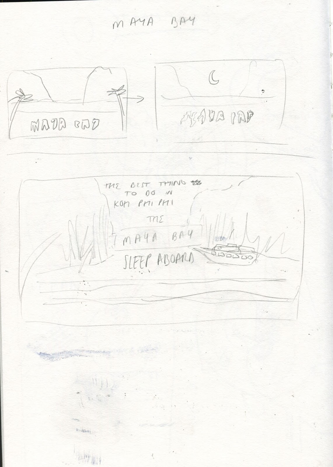

Basic Idea created using reference imagery - I wanted to maintain some accuracy in my image that reflects the real place, aswell as adding my own abstract/illustrated twist.


I attempted to create a day and night version of the image, making it seamless for if it were to jump from one to the other. I think that the night image is really atmospheric and immersive, but I did struggle in the day image to achieve an illustrated effect without it looking lazy - I decided to not pursue the day version as I struggled to create a consistent visual quality that I was happy with. It got me thinking that the day scene was unnecessary to communicating the necessary elements of the story.


This is my outcome for Maya Bay so far and I think it is definitely in need of some of development, however it has some successful elements. I think that the composition of the image is quite awkward, especially with the addition of text, however I like the concept of the bold/glowing blue in the dark water - I once again would like to refine the image so there is more of a focus on communicating the vital elements (The title, the boat, maybe the shore), and also work on animation quality as it looks really jolty and unprofessional.
I would like to refine the image maintaining the same concept, but with a more stylistic and visually consistent approach. I think that the use of a type face(as opposed to hand drawn letters) will improve legibility aswell and just create a fully rounded design.
Saturday 6 May 2017
FMP: Elephant Development

Based on my research into Animal Welfare campaigns, and the techniques they employ to generate sympathy, I decided to develop my idea completely employing some of their techniques. Once again having a focus on incorporating typography into my design, I mocked up an idea taking inspiration from the 'S' in the '36 days of type' post, using selective negative space to create a layered/3 dimensional effect.


I was actually really surprised with how this image turned out as I didn't think that I could animate (I must be getting better!) - although the style is still a bit digital and cold, I think it communicates well in terms of the concept. I chose to use this 3D cutout effect in order to make it seem quite life like, and to remind the reader that it is real animals that are being discussed in the article - I feel I have further conveyed this by use of subtle animation. The concept behind the peep hole was to create a sense of elephants being in captivity and separated from their families etc, quite a heavy concept but highly communicative, aswell as creating focus on it's eye.
I think this image is effective in terms of concept and creating immersive/interactive elements, but In terms of visual quality I don't think this looks alot like my work? It's a little bit too realistic - I think with this kind of thing, unless it does have an illustrative quality, why not just use a photograph? what does drawing it in a realistic style achieve? I still think this needs further development, but is a good visualisation of what i'm trying to achieve - more about the process of making interactive immersive content, than the image.
FMP: Animal Welfare Campaigns


As the article is about the welfare of elephants and the ethics behind elephant tourism in Thailand, I decided to research into other animal welfare campaigns to see what kind of imagery they use to generate emotion. From looking at these 3 examples, I can pick out straight away that each of them uses up close shots of the animals eyes, forcing the viewer to create an emotional connection with the animal to generate sympathy.
The use of colour is also very limited and they are quite shadowy/dramatic - some elements I should take forward?
FMP: Elephant / Image Development


These are the development stages of my response to the article about ethical elephant tourism in Thailand - I just feel that this outcome is a bit too illustrative? When making images I tend to over complicate them by making full on compositions full of small details, when really, all I need to communicate is the elephant. I think I've used colour well to create an immersive, and atmospheric image that does transport the viewer, but I'd just like more of a focus on communication.
FMP: Sketchbook

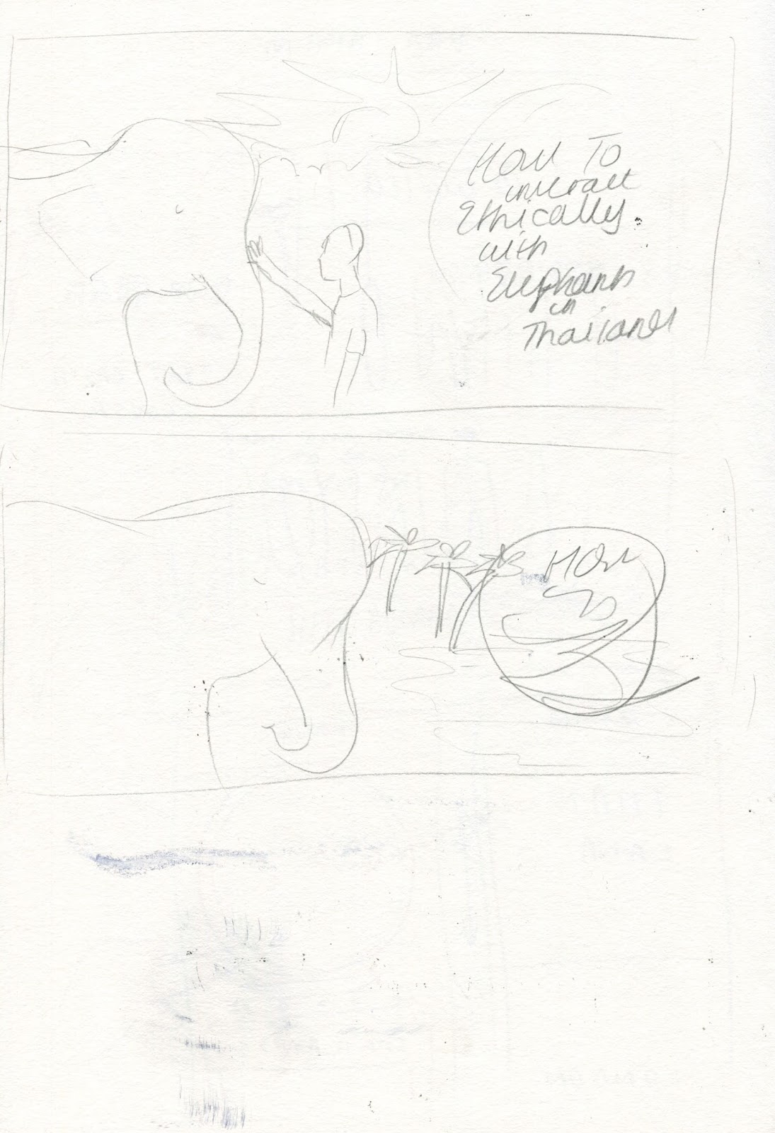
Once I had an idea of the shape/size of the type, I was able to start constructing an image with this in mind - My initial idea is to basically just draw an elephant in a rural environment, but create communication through animation, atmosphere and use of colour. It's not a massively developed idea but I think it's a good starting point.
FMP: Elephant Article / Type Experiments
To start designing my second outcome, based around the ethics of elephant tourism in Thailand, I initially focused on font/typography to generate a tone of voice for the article, to which I could start responding visually. Using dafont again, I selected a range of appropriate types that have an emotional tone of voice, and create a reflective/sympathetic element. Also I feel that creating the type first will allow me to compose an image around this, to avoid compositional problems later (as seen in the previous outcome). I created a range of different outcomes and received feedback on each of them:

Feedback I received:
(Top left) is my favourite one, communicates ethical elements through hand rendered type, looks like Lush cosmetics?
(Other 2) Types look too similar and are the same thickness, if you are mixing type they need to be different.
Shape of the text looks too square.

- Again they are all very square and don't communicate aswell as initial types.

I decided to play around with using my most effective type on the silhouette of an elephant, to give context and to create a somber/reflective atmosphere. However I think that it looks too basic and could be alot more immersive in terms of generating emotion? I intend to develop this idea using a more illustrative approach, which I will then animate. Good starting point though.
Friday 5 May 2017
FMP: The New Yorker / Layout Inspiration

I'm starting to think about how I am going to apply my images/how they will work on screen to accompany an article. I came across this article in The New Yorker which is completely full screen. I really like the layout of this as I think the negative space makes the viewer focus on the image before reading, so that they have a bit more of an insight/context into what the article is about. I think that the composition and minimal use of type lets the image breath, aswell as creating a trendy/modern and minimal aesthetic for the page, but allowing it to communicate to the reader on a fully immersive scale.
My Response

Taking inspiration from The New Yorker, I created a simple mockup for my website/app. I think that on screen, my image would create the fully immersive effect that I have been trying to achieve so far. I think that the layout design of my webpage could definitely use some development but for now I'm happy with this outcome as a whole and think it adds visual excitement especially, with the animated element.
FMP: Unusual Delicacies / Image Development
So I decided to abandon the illustrated type idea (for this outcome anyway) because I felt that it hindered the composition of the overall image, and when animated would only decrease legibility further. So I returned to the wacom reusing successful elements like colour and textural quality, as seen in my previous response.
So these are my outcomes for the 'Unusual Delicacies' article, which I think are successful and appropriate to the genre. I think they are quite dramatic and striking, created by the dark colour schemes and shadows, but also the deeper shade of red I've used to communicate oriental elements and a dramatic/sickly feel, appropriate to the topic.

I'm definitely alot happier with the composition now (even though half of it is hidden by the big ugly metal thing, which looks a bit out of place) - which once removed from the image creates a direct focus on the plate of shocking food. I've tried to create a contrast in colour schemes from the surrounding plates of 'normal food' just to communicate a little bit more instantly.

Stylistically I feel that i've used composition effectively to make a fully illustrative/immersive article header. I'm really happy with my choice of font, as I think it has connotations of cookbooks or menus? It's very traditional but a little bit modern and fun, which fits with the nature of this article perfectly.

Overall I'm really happy with this outcome, and think that all the elements in the image work effectively together in order to communicate the theme of the article. I also think that i've animated it with quite a punchy tempo which I think is also appropriate to the tone of voice of the article. One of my concerns however is that when converting my image to animation, it has lost image quality and the font has gone fuzzy? I need to research more into ways around this as it just looks a bit unprofessional.
Thursday 4 May 2017
FMP: Illustrated Type Experiment + Platform Mockups
I decided to develop some of my sketchbook work into an illustrative type based outcome, based on 'Strangest Food in Thailand'. As a starting point I liked this idea as I felt like it was visually very exciting, with alot of small details that make you want to look closer, I feel like it also provides instant context for the article.


Although this is nowhere near a finished product, I thought some elements were successful, like the use of red in the background to communicate an oriental aspect. Also in terms of image quality, I thought that the slightly expressive, textural quality worked really nicely, to give the image an 'illustrative aesthetic' (I want my images to communicate but I also want them to look nice aswell).
In terms of weakness, I received feedback that this image was slightly illegible, which is completely unacceptable when it's primary function is to be used as a header for an article. I also think that the colour scheme should be more considered, to communicate abnormal/disgusting aspects.


I've also started to think about layout and how my design will be used within an article/composition. I think in this particular example the composition looks very empty, and where I feel a title should be, is just blank empty space? I need to reconsider the composition for my image as a whole (text included), and perhaps either make my image spread across the whole screen, or or use unillustrated typography with an image.
FMP: Visual Inspiration / Illustrated Type Thoughts
After identifying google doodle as a unique idea, I've identified Illustrated Type as an element that could be used effectively in my outcomes. As Magazine/journalism spreads are very text heavy, I feel that this could be a way to incorporate an element of visual editorial content that could also maintain a function as a header for my articles. However I wanted to get collect some inspiration on how font and type are used to communicate.
Illustrated Type for Book Cover Design


These are 2 very similar examples of Illustrated type that use the construction of the type in order to communicate references from the story. Although these are for very concept heavy novels, I feel these techniques could be applied to less conceptual travel journalism. I think that the success with these outcomes lies in tactically arranging the type - for example the 2 A's in Great Gatsby positioned to communicate a building.
36 Days of Type (Instagram)

This is an account i've been following for a while, where I have also witnessed hundreds of people submitting their own responses to the 36 days of type competition/brief. I think this brief is a really exciting opportunity to explore type/font in any preferred way. I love the way that the account curates the images to show an array of diverse responses.


These are just 2 very different examples I picked out that I find really effective in use of colour and overall execution. I really like the 3d/layered effect that is created in the 'S', which is an element that relates to my idea of immersive illustration, and something jumping out of the page.
My own responses to Illustrated Type Brief


These are some of my own responses from my ongoing illustrated type brief where I have attempted to illustrate a word, using the type to create context. These are both quite obvious examples but I feel that they are executed quite well. Ideally(if I get time) I would like to develop these images using animation, so that they could look alot more developed on screen based platforms - another thing to consider for this project?
Subscribe to:
Posts (Atom)