
After having created 2 outcomes already, I had a better feel for what I was creating and how my image was going to function. My next image is about 'Maya Bay', the beach in Thailand where 'The Beach' with Leo Decaprio was filmed so it's a major tourist attraction. The article i'm responding to is based on the 'Maya Bay Sleep Aboard', a highly recommended experience that involves sleeping on a boat in the bay over night, and witnessing the magic of the bay come to life at night.
My first concept was to create 2 scenes, showing day and night and cut between the 2 to show how the "magic of what happens at night", referring to the bioluminescence of the plankton - a glowing blue effect in the water that looks really striking. I am aiming to create a picturesque scene, that communicates the magic of a night in Maya Bay.
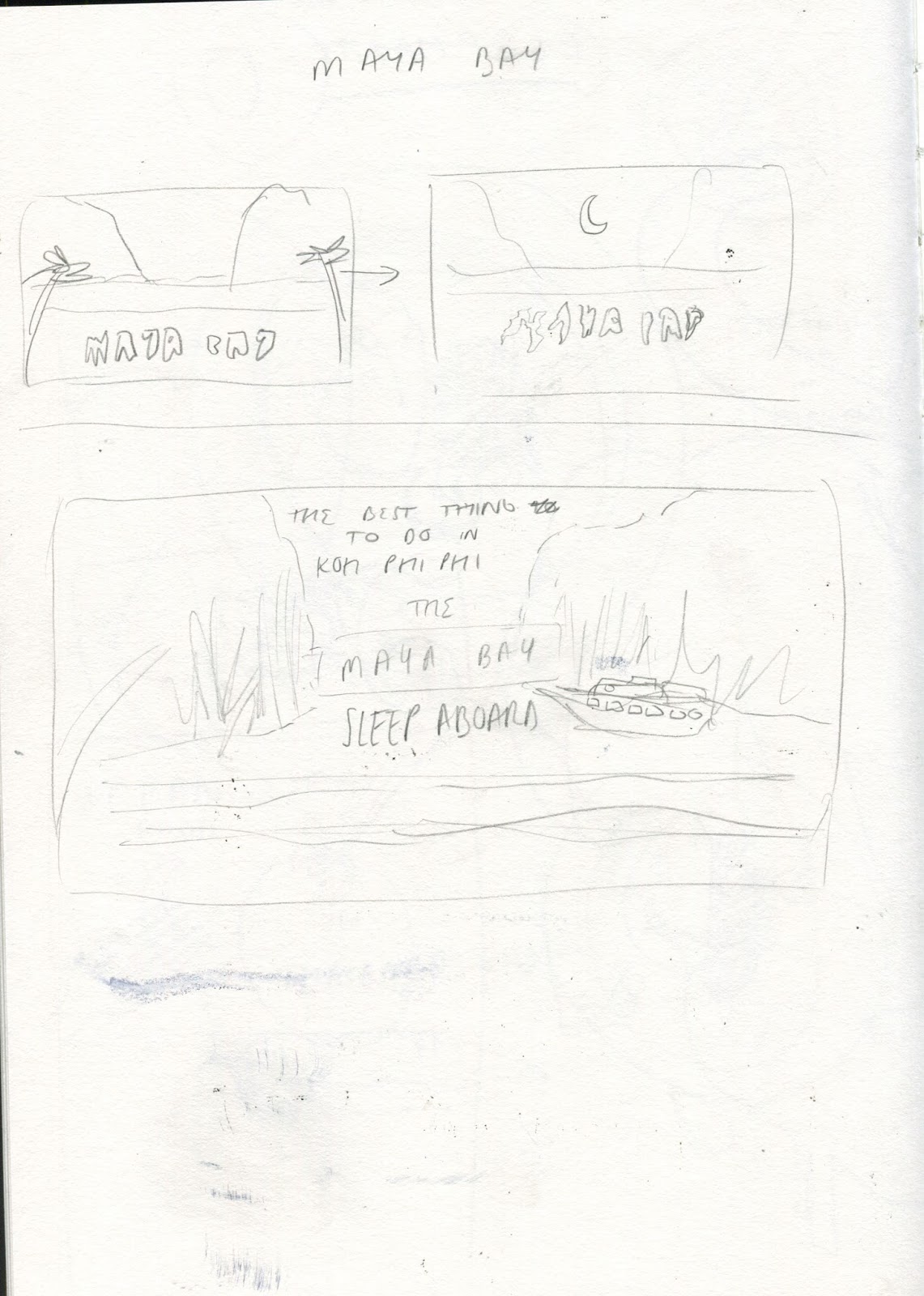

Basic Idea created using reference imagery - I wanted to maintain some accuracy in my image that reflects the real place, aswell as adding my own abstract/illustrated twist.


I attempted to create a day and night version of the image, making it seamless for if it were to jump from one to the other. I think that the night image is really atmospheric and immersive, but I did struggle in the day image to achieve an illustrated effect without it looking lazy - I decided to not pursue the day version as I struggled to create a consistent visual quality that I was happy with. It got me thinking that the day scene was unnecessary to communicating the necessary elements of the story.


This is my outcome for Maya Bay so far and I think it is definitely in need of some of development, however it has some successful elements. I think that the composition of the image is quite awkward, especially with the addition of text, however I like the concept of the bold/glowing blue in the dark water - I once again would like to refine the image so there is more of a focus on communicating the vital elements (The title, the boat, maybe the shore), and also work on animation quality as it looks really jolty and unprofessional.
I would like to refine the image maintaining the same concept, but with a more stylistic and visually consistent approach. I think that the use of a type face(as opposed to hand drawn letters) will improve legibility aswell and just create a fully rounded design.
No comments:
Post a Comment