Sunday 30 April 2017

FMP: Logo Developments

When designing a logo for my product/brand my aim was to communicate Travel, creativity, and overall a sense of reliability. I began by using cursive/handwritten fonts that I felt could reflect the personality of my brand/product. I wanted my logo to have a hand written element, but still look modern and digital, reflecting a modern digital product that utilises creativity, a very human quality. 

Using dafont.com, I identified these typefaces as having all the ideal qualities that I was aiming to communicate, however I feel like that in some of them legibility is lacking slightly (mix up a's and o's?).

I then found this one (below) that just clicked with me and felt very right. I think that the typeface has a slight automotive aesthetic (cadillac?) which I feel communicates reliability (in terms of delivering the best travel news) but also an element of digital. To communicate further, I tried adjusting some elements of the type. 
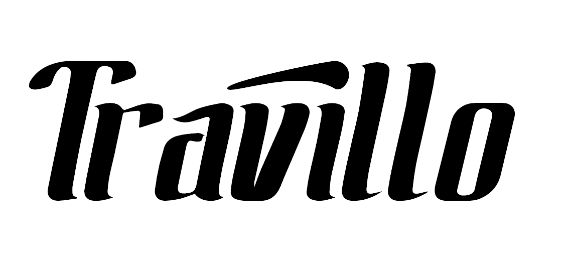
- Made the dot drag across the top of the word, as if it is travelling? Creates movement and expression.

Final Logo Design
I then developed the dragged shape to look like a very subtle plane wing. I really liked this because of the subtlety, but also just felt that the shape of the wing fitted really nicely with expression of the type, aswell as creating a bit of movement. I particularly like the calligraphic element of the type as it reflects hand rendered/quit expressive feel with attention to detail, and the way that it is very uniform refers to digital platform once again. 

I would perhaps like to experiment with animation if I get time, because I feel like, especially for this product, it would be a relevant way of bringing my brand to life. 

FMP: Logo Research / Market Research

Before starting the branding for my product, I wanted to have a look at some relevant competitors and see how they communicate the theme of "travel" through their logo design. 
Expedia - Travel deals
Uses the motif of an aeroplane flying around the world. Quite clean and simple font, has a friendly and informal feel. The use of blue and yellow communicates budget/cheap but trustworthy. 


Travlr - App by Samsonite 
This is the logo for an app that "minimizes" travel stress - "At set times it will remind you of important travel decisions like: have you got the right documents? Which cabin luggage sizes are allowed? What is the local currency rate?"

The use of bold/chunky typeface creates an element of reliability and stability - a quality, that when travelling, is what's needed in an app like this. This is also communicated by the use of the colour blue, which like in the expedia logo, communicates trustworthiness.


Lonely Planet
This is probably the most relevant example to my project - lonely planet is a best selling travel journalism company that sells guides and publishes articles online. They have used a unique font/typeface that communicates a fun/informal vibe, with the use of sharp edged font that communicates more scientific/mathematica vibes - the information they are providing is factual and trustworthy? They've also used the motif of a circle, which in this context refers to a planet/world.

FMP: Time Plan

 Due to the very short space of time I have before the deadline,  I felt it would be necessary to create a time plan based on my intentions for the project so far, in order to help me stay organised and ensure all my intentions are met in a logical and effective way. 

April overview / Time Plan


Saturday 29 April 2017

FMP: Creating a Brand Name

So it's occurred to me that I should take the idea of 'Immersive Editorial Illustration' and use it as a USP for a new product - A digital illustrated travel guide/app that features the work of different illustrators and animators for different articles/places. 

I'd ideally like to decide on a name and brand identity before I start experimenting with content to go inside as I think the brand identity will define that. 

I'm excited to begin, what now is, a branding project because I'm desperate to create more design based work aswell as illustration, and reflects my EP intentions of creating work for a commercial portfolio.

Brand Names?
Travisual
Travillus
Travillo
illoworld
Journillo


I want to communicate travel and design/artwork/illustration/visualisation. I particularly like Travillo (Travel and Illustration) and I think it sounds quite effective. I'm not going to get too hung up on this however as it is a very small aspect of my project - it's the concept/product that is important. 

FMP: Illustrated VR Attempt

I decided to develop my idea for a VR piece based on what I learnt in my experiment, now that I have a clearer picture of how it could be used. I wanted to create an image that I was actually happy with to realise the full potential of an illustrated VR outcome. To get the ball rolling I chose to make an image based on Phuket in Thailand, that could be applied to online travel editorial content, combining both illustrative and graphic processes. 

Reference Imagery:


My main aim of this piece was to create something that was immersive, using colour to create an atmosphere. This process was once again purely for experimental purposes, to help me define if VR would be an effective route to take for the rest of my project, leading me to do more research into the technological elements. 


My final images ready to be developed - I think these are quite effective because of how atmospheric they are, and how they communicate a relaxing feel as felt in the Santorini magazine spread. I think the concept of the floating type amongst the islands is a nice concept and communicates the unique visual elements of Phuket all in one decorative image. I felt inspired by my previous post about Google Doodle, as I thought it was an excellent way of combining illustration and graphics, whilst maintaining a function as a logo. I created this piece to be used as a visual header to decorate an article, however I feel that this element could be developed into a complete immersive user experience using VR:


My attempt at turning my image into a VR environment: I thought that using VR would be an interesting way to make the viewer engage with editorial content on a completely different scale. This is my original image that has been converted into an equirectangular format to be uploaded to a VR viewing platform. 

Unfortunately this test didn't work after many attempts of following the steps I used in my experiment - I think that you can get a feel for the immersive element in the panoramic image above, however I would've liked to experience the full thing. I spent quite alot of time fiddling around with the technological elements and still it did not work - After 2 attempts I think I can say that VR is a no go, because of technical difficulties that I do not know how to overcome. I wasn't thrilled with the idea to begin with as it involves basing my user experience around Facebook, which doesn't seem very professional and appealing. 

This test got me thinking about other ways to make my content immersive and interactive, leading me to try animation - 


I uploaded my composition into after effects, where I was able to add a variety of motion effects to bring my image to life and make it immersive. This is a more realistic direction that I can see my project going in, creating animated typographic outcomes that act as headers for articles, making them eye catching and communicative on another level. By adding a credit to an author, you can see the context I am using my image in, that would really push the concept of screen based editorial content. I really like this outcome, but I feel like it could be a bit more subtle taking inspiration from cinemagraphs - also I feel like an animated outcome like this could be quite distracting for the reader whilst trying to read an article. 

FMP: Idea Development

Today I began researching into articles that I want to illustrate for my Immersive Editorial Illustration project. I tried to find think of ways that I could select possible themes for my outcomes, countries, activities etc - but when it actually came down to it, I just want to draw Thailand. I am personally interested in this area as I will be travelling there over summer and have done alot of research already. I also think that the visual culture of Thailand is so bold and exciting that I'd love to visually respond to it in my project. 


3 Places I would like to focus on are Bangkok, Phuket and Chiang Mai. Each place has a different pace, environment, attractions etc that will give the project some visual diversity. 

So thinking about my final outcome, I think it will be a Thailand edition of a publication - 

Or maybe make my own publication/app/brand? I've already identified that there is a gap in the market for an online product that uses immersive visual features, which could be my products USP.

Friday 28 April 2017

FMP: Revised Project Proposal + Brief

So after recently reading my previous proposal for this, my final major brief, I feel that I have a much clearer idea of where this project is going in terms of areas to explore/research activities etc and has now been revisited:

Previous Proposal:
*** Statement of intent for Extended Practice as a whole has not changed, and feel I can confidently say I have stuck to it throughout the module. 


New FMP Proposal:

Thursday 27 April 2017

FMP: Travel Publications / Double Page Spreads

I felt it would be beneficial to collect some examples of double page spread designs to get a feel for what the typical travel editorial layout looks like, what types of images do they use and how can I take inspiration from these in own images?

Successes: Clean organised layout. Nice use of font. Clear and consistent colour scheme, creates relaxing feel.
Weaknesses: Images on left hand page look a bit crammed together? 


Successes: Nice bold use of photography on full bleed, creates immersive effect.
Weaknesses: Typeface is uuugly


Successes: logical layout for convenience and ease of reading on smaller device.
Weaknesses: No style atall - just image and text.

From looking at print and screen based journalism layouts, I have identified some techniques that make an effective and visually engaging layout. I have also once again identified a lack of editorial illustration which is something I intend to use to create a new type of product.

FMP: Google Doodle


https://www.google.com/doodles/about

Today my attention was drawn to 'Google Doodle', an open submission for illustrators/animators/artists to submit a version of the iconic search engine logo, in their own style, in order to communicate a theme/topic. Google is something that I use pretty much every day and I can't believe I've never looked into it before - I love the challenge of creating illustrated typography to create meaning, so It might be something that I have a go at. 

I would really like to take inspiration from this genre as I find it a unique way of adding context/communicating something through the use of illustrated type. My idea currently for the FMP involves creating visual content for magazine/journalism products, and this idea of illustrated/animated typography would be an excellent way to create visuals and communicate in a magazine layout.

FMP: Animated Editorial GIFS

I had the idea to think of other visual ways that are used to make news/journalism more immersive + engaging, and found examples of Editorial Animation/Illustration. Editorial illustration often uses visual metaphors to communicate elements of a text, however some platforms allow for animation aswell which communciates but in more powerful and visual way.

Examples Found through Behance:

Veronyka Jelinek


https://www.technologyreview.com/s/603746/the-war-on-the-disturbingly-real-trolls-in-virtual-reality/
https://www.bloomberg.com/news/articles/2017-03-08/the-expert-s-guide-to-crying-at-work

Burton Booz


https://www.behance.net/gallery/36088861/Ashes-to-Ashes

The use of animation provides context for this particular image - creates an idea of vintage electronic arcade games - hints that the story is to do with the 1980s? and David Bowie's iconic red thunder bolt.

Saturday 22 April 2017

St Wilfrids: Typography Developments

Some typography developments I created, just making my initial ideas look a bit more refined. At this point I'm just trying to get some initial ideas down for me to send Chris to see if i'm heading the right direction, and just to show some possible directions for the outcomes. 


I prefer these developments to the previous basic font experiments as I think they communicate more personality, and look a bit more trendy and stylised - however I still feel that there needs to be more of a focus on colour, and perhaps more of a concept other than just the slogan? My next step is going to be generating visual ideas in my sketchbook to see if something happens there.


These are the initial concepts that I intend to send to Chris for feedback - I'm hoping to get a 'go ahead' with the slogan and starting exploring it in a more visual and eye catching way, perhaps thinking about a more refined colour palette.

St Wilfrids: Sketchbook


Here I had alot more of a focus on creating type based outcomes, taking inspiration from what i'd learnt during my illustrated type brief. As use of language is such a key element to educational marketing, I identified this path as an effective way of communicating directly and clearly, as opposed to using vague and conceptual imagery.

Friday 21 April 2017

FMP: Thoughts on Exploring a Digital Platform

With media development and conversion to digital happening daily, I felt it would be beneficial to get a sense of how it could continue to develop in the future, as this is a platform I intend to utilise. I decided to do some research into the future of the paper book and how this will impact on the need for digital elements like VR/animation snd how it will effect my future career as a creative:

Are paper books really disappearing?
http://www.bbc.com/future/story/20160124-are-paper-books-really-disappearing

"Books are expensive to manufacture and ship, so the economic pressure to digitise will be great" - An insight into why digital publications are on the uprise. 

"In several experiments involving more than 400 kindergarteners, Bus and her colleagues found that kids who read animated e-books understood the story better and learned more vocabulary than those who read static ones. “For young children, written language is often difficult, but animated pictures can help them understand more difficult parts of the text,” she says"
- Thinking about how immersive content will effect on the way the reader receives the information.

Future of Printed Media/Advertisements 
https://www.themediabriefing.com/article/what-is-the-future-of-magazine-media

"“People are more acute than ever about sniffing out cloned content. Magazine content needs increasingly to be valuable and exclusive: what do you have that no one else does?”"
- It's better for a magazine to make unique content that noone can compare to - make reading it into an experience they won't forget/get anywhere else?

FMP: Digital Magazine Market

I've been trying to think of other digital journalism platforms that could possibly utilise my idea of 'immersive illustration' and if or not there is gap in the market for a new product?


Snapchat Discover

A new feature added to snapchat that has created another (very accessible) platform for journalism/articles/blogs/editorials to be consumed through social media site, Snapchat. It is a very instant and accessible platform that utilises a mixture of animation, motion graphics, photography, illustration, and makes the viewer interact with it by choosing to flick and swipe through the content.


Apple Newsstand

This platform from Apple is now a default app in every person's iphone, and allows the user to download digital replicas of magazine subscriptions to be viewed on their phone/tablet on the go. This is another example of the mass digital conversion that is happening to products every day. Although this app only makes direct, still replicas of the pages of magazines, I've identified it as another screen based platform that would allow for the use of VR or Animated content.


The New Yorker Online 

The New Yorker online is the first digital publication I've come across in my research that actually makes the most of being digital, using Gifs, animations and videos. I admire the new yorker as a brand because it really utilises creativity, employing illustrators and designers daily to make content. As stated before It is a very forward thinking brand, as highlighted by Christoph Niemann's VR Cover Design. 

Thoughts

From what I've found, there are alot of digital platforms that accomodate interactive, immersive elements into editorial/journalism products. For my project I'm thinking about utilising one of these platforms to create my own editorial illustrative responses that engage the reader more through the use of virtual reality or animation, to create immersive content to go alongside travel articles/journalism. I'm confident that this is an appropriate area for me to explore as it will give me the chance to explore creating digital illustrative and graphic content to create work relevant for commercial use. 

Tuesday 18 April 2017

FMP: Illustrated VR Test + Thoughts

In response to my research into travel publications, identifying the lack of VR/video/animation(and even illustration)/methods to make the most of screen based platforms, I decided to finally give VR a go, using a tutorial I found previously. In this experiment I wanted to just see how illustration could convert to a 360 image, and how the image quality differs/distorts etc. I created a very quick mockup of a beach just to see how I could apply this technique to perhaps travel illustrations.


Step by Step on How I made my own VR 360 Image

Step 1 - I created horizontal cube grid from a 'equirectangular' pattern I downloaded online.

Step 2 - I then identified which areas were which to help me plan my image.

Step 3 - I added a basic line of sight/horizon to help me plan my image out further


Step 4 - Started to actually create the image


Step 5 - converted my image back from a horizontal cross grid to equirectangular to create a full panoramic image. 


Step 6 - I then uploaded my image to facebook which converted it to a drag and view 360 panoramic image. Unfortunately I really struggled to find a way to embed it onto my blog so these are only screenshots from facebook. It was quite a weird experience however. I feel that if done properly (with a successful image) this would definitely encourage the viewer to look around and interact with elements of the image.

Thoughts

So now I can officially say I know how to make my own illustrated VR 360 image!

For an experiment I think it worked out quite well, enabling me to understand how it converts from a flat image to a 3D one, and what to consider when constructing the image. However, this experience also made me realise how much of a pain in the arse it is to embed/share your work when it's in this format? I think if it was a more accessible and convenient platform then I think this would be an exciting area to explore, but In terms of taking what I've learnt here and applying it, I'm not that interested in pursuing VR for this project as I don't know how I'd go about submitting and displaying it, other than facebook. It's a shame that these technical hurdles are what's stopping me, but I don't want to make something if I can't show it off using the platform of my choice.

I'm not completely giving up on this way of working as I think it would show in my portfolio that I am commercially and critically aware of developments in technology, also showing that I can adapt. Also I think its an amazing way to develop my illustrations to make them completely immersive. 

Sunday 16 April 2017

FMP: How to create your own 360 Illustrated VR

I've just found a step by step guide to illustrating your own 360 Virtual Reality Image, which looks a bit terrifying and I need a lot of software, but I think it could definitely be worth a try. Since looking into it I've been really eager to give it a go, to see what kind of an effect this would create in an illustrated piece.


http://studiobehind90.com/2016/12/25/how-to-create-360-panorama-painting-in-photoshop/

FMP: Travel Publications

After looking into contemporary Virtual Reality and finding ways that I could use it's processes to benefit my practice, I was inspired by Christoph Niemann's VR New Yorker Cover, to start looking at using it to bring Editorial to life and make journalism more of an immersive experience. As stated previously, I have identified the travel genre as something i'd like to continue exploring visually, so I started by identifying some online travel magazines/blogs and just getting a sense of how they engage their readers and present their content:


Travel Weekly 

worldtravelguide.net


escapismmagazine.com

Thoughts

Each example I looked at uses a very traditional approach in terms of using just editorial photography to go along side their articles, even when they're being viewed on a screen based platform. They are all very photography based aswell - travel illustration is definitely a well-established genre, but these particular examples do not seem to use it atall. 

I feel like these articles/websites could be so much more immersive in terms of engaging their reader and communicating editorial content on a more powerful/immersive/interactive scale - They are not making the most of having a digital screen based platform, on which they could communicate with their readers on a much more powerful and exciting scale. I have identified online travel magazines/blogs to be a platform where I could explore creating 'immersive travel illustration', referring to making visual editorial content that creates a visual experience for the reader. This would also refer to my statement of intent in terms of creating commercially and critically aware work for my portfolio. I think this idea of 'immersive content' would work really well with my practice at the moment as I enjoy making images using atmosphere, light/shadows, colour and 3d(ish) rendering. 

Saturday 15 April 2017

FMP: Contemporary Virtual Reality / it's nice that

The previous exibition at the Leeds City Gallery really prompted me to think about ways that Virtual Reality could benefit my practice, and how other artists are using it.

When deciding to look into contemporary use of Virtual Reality, I went straight onto it'snicethat.com because they're a really up-to date publication/blog that report on the latest news/breakthroughs in the world of Art and Design. I just wanted to get a feel for how people were starting to make use this of technology, and try and see if any illustrators/animators have utilised the platform to develop their work. 


Visualisation of VR Exhibition 'Threshold' by Mat Collishaw

Mat Collishaw’s VR artwork at Somerset House will restage the world’s first photography show
http://www.itsnicethat.com/news/somerset-house-and-photo-london-announce-exhibition-of-mat-collishaws-first-virtual-reality-artwork-140217

A VR based fully immersive experience based on the concept of going back in time and seeing the world's first ever photography show. A really interesting idea with a bit of irony(in a good way) as it is showing how far photography has developed, using the epitome of developed camera technology. 

------


Greg Barth directs Jack Sachs’ bizarre VR characters and bored office workers in latest video

http://www.itsnicethat.com/articles/jack-sachs-greg-barth-red-axes-video-130916

Quite a strange video which shows elements of rendered/ Animated VR, something that could be relevant to my practice and an area for future exploration.


------

Christoph Niemann creates VR animation of his latest New Yorker cover illustration
http://www.itsnicethat.com/news/christoph-niemann-new-yorker-vr-animation-300816


I think this example is a really unique concept - a VR animated development of an illustrated magazine cover. The New Yorker is iconic for taking risks/giving a fresh take on design, but I think Christoph Niemann really outdid himself here. Though the use of 360 VR doesn't really improve communication, it just creates another platform where someone could be communicated to. The way that the video makes you interact with it in order to watch the ball be hit back and fourth across court, is an element that I felt was missing from the Google Expedition experience we had. I think this is a really fresh and exciting way of viewing editorial content that I intend to explore. 

-----

So after finding these examples of creative/illustrative/communicative use of VR, it made me think that perhaps it's not an impossible idea to explore creating my own 360 image. I love how it just adds another dimension to communicating, even past video, fully immersing the  viewer in it. 

Friday 14 April 2017

FMP: Virtual Reality @ Leeds City Museum - Google Expedition


Today, me and some pals visited the Leeds City Museum to see a Virtual Reality exhibition hosted by Leeds Young Film Festival 2017 - It was basically a variety of activities that involve some aspect of Virtual Reality, including a 360 dome, and features from google expedition and google cardboard. Unfortunately all the cool activities were fully booked, but we managed to get a google cardboard headset each and book a place on Google Expeditions.


screenshot from /edu.google.com/expeditions/#how-it-works


Unfortunately I couldn't photograph the experience as we were sat in a board room with a very scary eccentric man (and all the magic was happening between our eyes and a phone screen anyway) - but basically it involved us wearing a cardboard box with a phone/screen attached to it at the other end so that the screen created an immersive experience in which we could look around a certain place in 360 degrees and be educated about certain elements in the images we saw. We were -transported- to an Orangutan sanctuary in Bornio where we learnt about the effects of deforestation. I thought this was a really exciting and unique experience, but my only issue was that it was just a still image and was still a bit disengaging. I feel that if it had subtle movements and sound effects it would've been a bit more entertaining and a lot more immersive.

Although I'm really not sure how i'd go about making a 360 degree video/animation/gif to be used within google cardboard/google expedition, this experience really inspired me to think of ways that I could push Illustration and design using development in technology such as Virtual Reality. Technology is developing so I feel that as a creative I should be prepared for what's next. We were also given our own google cardboard headsets each for free, so I now have a tool that I could start exploring VR if I wanted to.

It also relates to the whole idea of 'Travel' that I previously stated as a possible area for exploration in my FMP.