Thursday 8 December 2016

Illustration Friday: Soup


After just having a look on Illustration Friday's website, I really liked the theme today and just felt like making something, so I just used this is a kind of warm up, and to keep my momentum going. I will be using the Illustration Friday themes to create a project, however this was just a one off submission today. 

I had alot of fun making this image, adding harsh shadows from the campfire etc, using a very dynamic and cinematic composition . Although there are a lot of things that need altering, e.g realistic anatomy of the character, I think the image is very atmospheric and perhaps a good piece for my portfolio. 

Tuesday 29 November 2016

Christmas Card Brief: Design Boards

Some design boards I made for the next upcoming Crit. I'm yet to print my design and make it physically which is something I need to do before the deadline. However these boards should display my process so far:


Monday 21 November 2016

Christmas Card Brief: Final Design


My final christmas card design - I think it's easily identifiable as the Blenheim Walk building and I've tried my best to make it look a bit christmassy. I think the image looks really atmospheric and heartwarming - I wanted to communicate the idea of 'lighting the way' and warmness/friendliness which was mentioned in the brief. I decided to use a rounded shape to reference snow globes, a traditional christmas decoration. 

This is just the on-screen design, however I want to develop it using paper cutting and paper folding so that it has a 3 dimensional and crafted feel. It will also have a rounded shape which I feel will make the card look unique, and further reference the concept of a snow globe. 

Wednesday 16 November 2016

To Kill A Mockingbird: Development

To start developing my idea of focusing on the buildings within Maycomb that are symbolic of different themes within the story, I began to experiment with ways of drawing architecture. 

I quite like this style, especially the textural quality of the shadows, however I feel that they are still too digital looking and rigid. I think that the colour scheme looks slightly too dull/boring aswell, it doesn't really give the impression of major symbolism within a story. I do like the textural elements though as they create reference to children/children's drawings, which links with the children characters in the story. I think that these images also have quite contemporary, trendy feel to them which would help my cover to fit in to the current book cover design market.

Selection of themes form the book that I need to convey with my front cover:

Racism 
Good and Evil
Innocence 
Naivety 
Social Recluse 

To Kill A Mockingbird: Sketchbook


Using the Maycombe map I found during my research, I created some mockups of book covers that focus on the various buildings that symbolise each theme in the story. I really like the idea of looking over the town, and think that it would make an effective design also. Using the concept of the town as a whole, I think this leaves alot of scope for communication and symbolism within the book. Taking inspiration from the architecture book from nobrow, I had the idea of creating a continuous wrap around cover of buildings from the town which I will explore in more detail.

Tuesday 15 November 2016

Christmas Card Brief: Development


This was an idea that I was playing around with which i think is quite effective in communicating christmas and leeds college of art. I don't think that this image conveys the crafted feel that they asked for in the brief however, it was a good idea to get down and does look highly commercial.

---

I found these examples of 3D paper cut cards on pinterest, and thought these were really effective ways of developing an idea. I especially thought that the first example uses light really effectively and innovatively in order to create definition and contrast within the design. I like the immersive feel that these designs have, and turn them into something that would be like an ornament, not just a greetings card. 


I've decided to base my design on the Blenheim Walk building in my design because I think it's quite iconic with it's circle window, and to business partners etc, it would be instantly identifiable. I'm hoping to make the building look christmassy, which I will develop soon.

Reference image of the college building

To Kill A Mockingbird: Idea Development

After creating a load of rubbish sketches for my initial ideas, I chose to return to researching the story/town/characters:

Inspiration

I was really inspired by an infographic type poster on pinterest about To Kill A Mockingbird, in which it highlights the concept of each place/building within the town, being representative of a different theme within the story. For example, the Courthouse being representative of Prejudice and Truth. I think this is a really exciting idea, and although I don't really enjoy drawing architecture, I think the idea of focusing on the different buildings is really effective. 

1930's American Architecture


From my research I found that the book is set in the fictional town of Maycomb in the 1930's, however I was able to locate some images of 1930's American architecture in Alabama, which Harper Lee has expressed is where she got her inspiration from. This type of setting is used quite alot in visualisations of the book, however I would like to put my own illustrative twist on it. I think it's quite exciting how quaint the town is described, with picket fences and tyre swings etc, yet with so much evil running throughout it. 

Contextual Source - Nobrow Press' London Deco


The idea of architecture led me to think of this book that I have seen in the Library, which I think is visually beautiful. The book was published by Nobrow Press and displays a typology of London Deco buildings. I don't think the subject matter of the book is that exciting, but the craft and aesthetic of the images inside are mind blowing. I love the composition of each page, as if the buildings are side by side, which is an element I will take inspiration from in the development stage. 

Friday 11 November 2016

Christmas Card Brief

Brief:

To design and make 75 Leeds College of Art Christmas Cards to be mailed out to key College contacts

Leeds College of Art works with a variety of businesses including governors, community groups, artists, suppliers, creative businesses etc.

As a seasonal gesture of appreciation and thanks, staff here at the College would like to post a Christmas card to those that we work with.


The card must have a crafted feel, but look professional and artistic. It must also have the College logo on it somewhere. You will be responsible for the production of the cards. The final cards must fit inside an A5 envelope

unless your proposal is more unusual and includes the production of envelopes.

Content must include ‘Merry Christmas and Happy New Year from Leeds College of Art’


Tone of Voice


• A friendly and informative tone of voice should be used.

• It should be professional, considered, and innovative whilst portraying the College as a leader in art education.

Concept/Ideas


Please consider and reflect these words in your concepts and ideas:

Christmas, friendly, creative, vibrant, specialist, independent, unique, innovative, quality, and contemporary. Please refer to the Colleges brand guidelines for further assistance.

Initial Ideas:

This is going to be quite a quick turnaround brief due to the timescale given, so organisation will be key, though I feel like it's a good bitesize brief to handle at the moment, especially with the focus on COP. I'm quite excited about the idea of a christmas card, I like making cheesy things which I feel this brief is all about, and I think that greetings card design is another oppurtunity to create a product using illustrative and graphic design processes.To start, I looked into some examples of crafted christmas cards online, as that will be an element in this brief:


I've never really used paper cutting as a medium in my work, however I feel that it would be a really effective way of pushing my images further. I really enjoyed collage last year in Applied Illustration, so that's definitely something to consider. 

My initial thoughts are creating something to do with the LCA mosaic logo, as I think it's really unique and is a key part of the college's identity. 

Thursday 10 November 2016

InDesign Refresher: How to make a book


- Always work with actual size digitally
- Document set up, preset sizes and custom sizes
- Columns and Margins: content and composition guides 
- Gutter: The space between columns
- Margin: The border around the page, if you don't work with margins the page is full bleed.
- Bleed: used to compensate for any inaccuracies when trimming sheets. Should always be a consideration. Generally about 3mm.
- Slug area: another area you can set that sits outside the page. Generally about 2cm. Enlarging the print area to include things like registration/crop/printers/fold marks.
- How you are going to print it? Always consider page size. If you are printing A4 spread, needs to be printed on larger than A3. (Digital Print room - SRA3 - Oversized A3 paper)
- How to arrange pages in print spreads:

- When printing larger amount of pages: Print in sections. e.g 64 pg book, print in 2 sets of 32, 32. or 4 x 4 sheet sections. Heavier stock, you would have fewer pages. 
- 2 up Perfect bound 
- Creep, too many pages so middle will sick out. Creep Value: if you are concerned that creep will be an issue, adjust creep values. Make a mockup and measure how much middle pages are sticking out e.g sticking out by 5mm, type in -5mm.
Photoshop Image Preparation

- Resolution of 300PPI
- Actual Size
- CMYK(near as possible to actual print) or greyscale
- Save as tif. or psd. not .jpeg
- Load image in indesign File > Place 
- Changing size of image in indesign, changes resolution of image. Scale Percentage - However much the image has been enlarged or reduced in indesign. Make sure Resample is ticked when adjusting height/width of image. File > Save, and image will adjust accordingly. 
- File > Package: gathers everything your indesign layout needs to print, into one folder.
- Press Quality is best quality for commercial printing. 

Printing Websites

- https://www.newspaperclub.com/ (follow guidelines available on website)
- www.blurb.co.uk

Wednesday 2 November 2016

To Kill A Mockingbird: Cover Initial Idea


This was an initial idea I just had to create straight away. I chose to create a perspective in my image that is not seen in the book, of Boo Radley, a social recluse who watches the 2 main characters grow up from afar. 
I really like the concept of the image, especially the small details from the book, e.g the soap dolls. I think the image overall though is quite dark, which looks slightly misleading? To me it looks like it belongs in the crime genre. I think I want it to have more of a warm atmosphere. Also the use of red text reiterates the crime genre. 

I don't think the quality of the image is very effective either, I don't enjoy that it was obviously created digitally which is something I'm trying to avoid. I want to incorporate alot more texture and expressiveness to communicate a warmer more authentic feel within the cover. 

Also in comparison to my research, I feel that my final outcome needs to be alot more symbolic of the storyline. Boo Radley is a part of the story, but not really the main aspect. Perhaps this would work better as an illustration inside the book?

Tuesday 1 November 2016

To Kill A Mockingbird: Initial Sketching


I really just wanted to use my sketchbook as a way of idea generation, drawing speculatively. I just wanted to get all of my initial ideas down on paper, such as characters, buildings, and visual metaphors like cats and birds. I think the cat and bird idea is quite effective in terms of communicating, however I think it's been done many times before and i'd prefer to think a bit more outside of the box. 

Another idea I had was about focusing on the character of Boo Radley, the social recluse in the story that watches the whole story unfold. I like this kind of perspective/point of view idea, seeing the story from a different angle, and it relates to the quote from the brief about finding a fresh take on the story. 

Monday 31 October 2016

Travelling Man: Poster Design


To Kill A Mockingbird: Research

To start developing my idea, I did some primary research by reading the book, but also using spark notes(not cheating) as a way to identify the key emerging elements in the book.


Lessons from the book:

- Put yourself in others people's shoes.
(Scout in Boo Radleys' shoes) 

- Don't kill mockingbirds. Mockingbirds don't eat anyone's plants or harm anything.
Mockingbirds make music. Anyone who is weak or defenceless
To Kill A Mockingbird - to take advantage of someone weaker than you. 
To destroy Innocence.
(Black man with 1 working arm, accused of rape to hide the fact that mayella is lonely and tried to seduce him) 
(Boo Radley) 

- Keep fighting even if you know you're going to lose. 
(Atticus with trial)

- The world is very unfair. Justice system is tainted by unfairness.
(Black prejudice, he was never going to win the trial)

I read this book in GCSE and was lucky enough to find my own annotated copy. This list of lessons from the book are an excellent starting point in terms of creating visual metaphors for the front cover. I don't think I will be able to portray all of them so I will just choose 1 to focus on. 

I'm really interested in the character of Boo Radley, and feel that he is so symbolic within the book. I think that making an image from his point of view would be a fresh take on the story.

Target Audience

The book has some very serious/adult themes within it, that are tackled in a very subtle way, making the audience for this novel debatable. Despite the adult themes, there is room for alot of imagination when reading the book, which would be ideal for a younger audience. Also it would be beneficial to them to learn the lessons from the book, so In conclusion I feel that the audience is 12/13 year olds +.

Themes


Racism
Good and Evil
Innocence 
Naivety 
Social Recluse 

Key Quotes

"Maycomb was an old town, but it was a tired old town when I first knew it. In rainy weather the streets turned to red slop . . . [s]omehow it was hotter then . . . bony mules hitched to Hoover carts flicked flies in the sweltering shade of the live oaks on the square. Men’s stiff collars wilted by nine in the morning. Ladies bathed before noon, after their three-o’clock naps, and by nightfall were like soft teacakes with frostings of sweat and sweet talcum. . . . There was no hurry, for there was nowhere to go, nothing to buy and no money to buy it with, nothing to see outside the boundaries of Maycomb County. But it was a time of vague optimism for some of the people: Maycomb County had recently been told that it had nothing to fear but fear itself."

"You never really understand a person until you consider things from his point of view . . . until you climb into his skin and walk around in it."

I think from these thoughts and ideas I've got enough to start sketching and exploring visually. Admittedly I feel regrettable that I don't have the time to read the full book again, but from researching I can remember it very clearly. 

Contextual Analysis


I found this cover that I think is really successful. The motif of the feather has been used effectively to depict a black man's face, creating the link between racism and innocence. The way that the feathers are arranged within the image depict the death of a bird, and highlights the representation of Tom Robinson as the mockingbird. I think the colour scheme of blue has quite a somber and reflective tone, depicting a tone of sadness within the book.  


I think that this cover is effective in the way it has used the format of the book in it's illustrative process. The motif of scales reiterates the theme of injustice, with the use of a black and white colour scheme to represent Good and Evil, and loosely the skin colours of the opposing sides within the novel. This cover uses heavy symbolism to convey the themes in a modern and contemporary style.  


With the previous 2 covers, I feel that they are very focused on symbolism and are quite graphical in terms of art genre. I really appreciate the more illustrative quality of this cover because I feel that it has more of an atmosphere, aswell as communicating a story within the image. I think that the colours create a heartwarming atmosphere in a vintage style, which I think would appeal to a younger audience. 

In terms of the competition, I am fully aware that this prize is for Adult Fiction, so the target audience for my design should be solely for adults, which the first 2 covers exemplify. 

Friday 21 October 2016

Extended Practice: Time Plan


My current action plan for the next 2 months

This is a breakdown of my workload for the next coming weeks - my attempt to organise my time effectively so that I can balance Extended Practice and COP effectively. 

Even If I don't reach these mini deadlines, I know this list will be useful in helping me to prioritise what needs to be done when, in order to meet the important submission ones (although I will try my best).

Friday 14 October 2016

Penguin Random House: To Kill A Mockingbird brief 2017


Brief


We would like you to design a new and classic cover for this book. The trick here will be to come at it from a fresh perspective and to avoid repeating the obvious iconography from the many previous editions in print. If you can get your hands on a copy of the book in order to get a sense of the beautiful writing, this will only help to inspire your design. The cover should feel timeless and confident, and appeal to a whole new generation of readers.


The winning design will need to: 
have an imaginative concept and original interpretation of the brief 
be competently executed with strong use of typography 
appeal to a contemporary readership 
show a good understanding of the marketplace 
have a point of difference from the many other book covers it is competing against 


The closing date for entries is 12:00 (GMT) on Tuesday 7 March 2017.


Initial Thoughts

Now that the books have been released for this years book design competition, I'm really excited to get started as I regrettably didn't take part last year. The books chosen for this year, To Kill a Mockingbird, In Cold Blood, and The Secret Diary of Adrian Mole Aged 13 3/4, are all incredibly diverse in terms of genre. I feel that my particular tone of voice lies with To Kill A Mockingbird/Adult Fiction brief because although it is told through the eyes of a child, it still has serious undertones - I like to think that my work would fit in to a serious genre although it is quite colourful and bold. 

I think this brief fits into my focus of creating work for commercial briefs as book cover design is highly commercial, and demonstrates my ability to use text and image in one product - something that I'm identifying that I enjoy doing in my practice. I like creating the images but also using text to make a finished product, so this brief should be a good opportunity to explore those elements. 

Thursday 13 October 2016

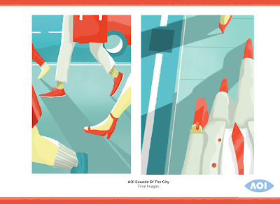
AOI Sounds Of The City: Development + Application

London Transport Museum / Merchandise Research


To give my outcome more context, I thought it would be interesting to develop it into a campaign that I could use in my portfolio in order to display illustrative and graphic skills. I proposed that my image could be used for marketing material for the London Transport Museum(which is part of the prize, but just incase I didn't win):


Though this poster isn't by any means perfectly designed, I feel it has a basic concept that is relevant to what it is trying to communicate. I think that the orange colour works really well and is relevant to the train ticket. I did struggle to place my image into a well designed/composed poster however because I think it is quite awkwardly composed in terms of adding text to. 

Some presentation Boards I created for the next upcoming crit:


Here I mocked up my images onto merchandise, taking inspiration from the research I did previously, which really helps my images identify as commercial pieces of Illustration, and makes it clearer how I am creating work that suits my goals and my practice. I really enjoy creating things like mockups so I feel like I really got the most of my image and created a believable set of products and outcomes. 

Wednesday 12 October 2016

Extended Practice: Proposed Briefs

Illustration Friday


Brief: Create bottle design for a cocktail/alcoholic drink, based on given theme once a week (as best as I can)
Product: Bottle Designs, promotional material for product

YCN

To be discussed with my collab partner. (Student from Graphic Design)

Penguin Random House


Brief: Create a design for a book cover, based on given titles. 
Product: front, back cover and spine design.

*** I'm also thinking about extending the brief to create a promotional campaign for each book, shop window displays, bookmarks, posters etc, depending on how much time I have. I think it would be a great way to push it into a more advertising like brief, which was one of my goals for this module.