Tuesday 28 March 2017

Extended Practice: Crit Feedback


Work ready/printed out and displayed on design boards in preparation for the Crit. I wanted to take this opportunity to display my work so far on professional and visually intriguing boards, tailoring the design of each one to the visual style of the brief. 


My Feedback + Reflection:

From looking at my feedback, as lovely as the comments were I think I can say that I didn't get any comments that were of massive use to the development of my outcomes - it's just helped me realise that I've identified a way of working that does look visually effective - and that my work is perfect already? *hairflip* (Joking) 
I think this exercise was useful in helping me realise the defining characteristics of my visual style - comments about lighting, storytelling, colour. 

Monday 27 March 2017

Nest: Image Development

After the Nest submission brief, I felt a bit unsatisfied with my outcome as it didn't really serve any purpose other than to just be visually enticing. So I decided to research into appropriate ways that I COULD develop and apply my image to suit a commercial context, and found Book Design.


I identified this book by Neil DeGrasse Tyson 'Astrophysics for people in a hurry', something that i've been wanting to read for a while, as an appropriate book in terms of subject matter, but also concept. The idea of someone being belittled and overwhelmed by Astrophysics is an element that could be communicated through the use of vast composition and small figure. 


I think I was able to locate and source appropriate typefaces in order to create a fully functional and effective cover. Also I was able to use type and image effectively to really push and develop my images to be used in a commercial context.


I was much happier with this outcome as my response actually had a purpose, and now maintained a professional and fully finished approach. This piece will definitely go in my portfolio to demonstrate layout and type. I'm glad that I have also located an appropriate pathway in order to develop my outcome to help it resonate with my intentions for the project. 

Friday 24 March 2017

Nest: 'Space' Submission

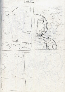
So today I got an email about an extension for the Nest magazine submission, based on the theme of space. I love drawing skies and making them bold and abstract and colourful and felt that this would be excellent oppurtunity to do so, and get published in a wide reaching publication. This brief was a really quick turnaround (a day) so I began sketching straight away. I didn't have time to build an amazing concept so just began with basic imagery like spacemen and planets etc. I wanted to use a simple concept and do it well, making a bold and colourful submission.

In the context of creating work for a publication, I feel that this brief is more about creating something that people would want to put on their wall? Poster design? Other than these, I can't think of any other way images in this context would be utilised, other than to generate publicity. 


Visual Inspiration - Been watching alot of 'Cosmos' recently on Netflix and found the colour schemes of their visual explanations of space to be really inspiring. 


Whilst creating the image I tried to experiment with abstract ways to make the sky bold and dramatic, so once deciding on a colour palette I used the liquify tool(photoshop) to swirl the colours together which I think looks quite effective (and like space). My main focus whilst making this image was to make something that was instantly eye-catching, and I feel that the bold use of colour achieves that. 

Overall I think this piece is effective in the way that it communicates the 'space' theme straight away, in a bold and cinematic composition. I think I've used light colour and shadow effectively to create an effective poster design/decorative image to go in a magazine

 Although it slightly annoys me that it's just a bit meaningless and basic. I think it was a good oppurtunity to just explore image making. I intend to develop this image a bit more and find a way that it could be made relevant to commercial illustration - could it be used to advertise something? Promotional work for 'Cosmos'?

Tuesday 21 March 2017

YCN Greenalls: Improvements Made

So based on some feedback I got and some opinions I formed from the billboard mockup exercise, I decided to change a few elements within my design so that they communicated alot easier.


Improvements made:
Top Image: 
Fuller composition - Made the figure bigger, with a bigger more identifiable Neck Collar (Visual Clues to Shakespeare)
Union Jack motif on costume to reiterate classic British visual identity of Greenalls
More legible Type, but still maintaining cursive, hand written feel.

Bottom Image:
More legible type
Union Jack motif 

I'm now confident that these are better pieces in terms of communicating not only the campaign message, but the brand values of Greenalls also. 

YCN Greenalls: Ad Mockups + Reflection


I created some advertisement mockups to see how much of an impact my campaign would have if someone was to see it, and I really feel that this was a worthwhile exercise. 

I think that the harsh use of green paired with the Greenall's logo communicates greenall's instantly. The only thing I think could be a bit more effective is the use of type, because I think it is slightly difficult to read, which if someone was in a rush would be a problem. Also (from afar) I'm not sure that the top billboard communicates shakespeare straight away either. I've tried to use alot of visual clues in the image, for example skulls, books and the frilly collar, however I feel that without noticing these small details, the audience would have to rely on the 'All's well that ends well' pun that they might not even be able to read.

In terms of image making, I think there are some really effective elements within my outcomes like use of compositions, lighting and colour, and I think that through these I have communicated a good idea for this project. In terms of overall execution I feel these outcomes are lacking in attention to detail and legibility, so are definitely in need of further development. 

Saturday 18 March 2017

YCN Greenalls: Poster Design (Part 2)

David Tennant performing Iconic Scene from Hamlet

Idea/visual Development

In my image I wanted to make reference to the famous scene from Hamlet, the holding up of the skull. I think this is an iconic image linked with Shakespeare, an actor kneeling down on one knee holding up a skull saying the words 'to be or not be' (not sure how accurate these references are to Hamlett, but even if they're wrong, I think that creates a bit of humor). In my drawings I started playing around with viewpoints, and because my work tends to have quite a cinematic feel, I wanted the image to be dynamic. I found a dyanmic view for my image by using photography to create reference material to draw from.


So this is another addition to my Shakespeare Anniversary Campaign for Greenall's. Here I've actually had to draw shakespeare's face - I don't usually make characters so this felt a bit strange, but I think I managed to illustrate it in a way that it fits in with the campaign and conveys that subtle humour. I'm not 100% thrilled with this image still and I think there are still alot of improvements that could be made, like the addition of small details. However I think this reflects my idea, and my ability to think up effective concepts, which was a personal goal for this module. Also with YCN/D&AD a huge part of it is about the idea creation and identifying an appropriate outcome. 

Friday 17 March 2017

YCN Greenalls: Campaign (Part 1)

I  decided to develop one of the first sketches I made when starting this project, and feel like this is where my idea really started to come together. Initially I had the idea to make a chavvy shakespeare inviting the audience back to hi for an after party after a play as I felt this would not only create humour, but appeal to the millenial target audience and hint at the idea of buying Greenall's for the party! 

'After party at mine yeah?' + Colour Experiment

When producing the image I felt that I should be a bit more subtle with the humor, and communicate it more visually. I also thought that it might be seen in bad taste to make shakespeare into a chav, especially when the bottle is to celebrate 400 years since his death. 


This is the final image I came up with for a billboard advertising campaign, that could be used also on the underground etc. This image took a while to make because of all the small details, shadows etc within it, but I really enjoyed crafting this environment. I based it on the design of The Globe theatre, using reference imagery from google. I think that the composition of the image works really well and creates alot of depth. I've identified that I need to work on drawing figures more as this was the part I struggled with the most, however I think I was able to communicate well enough that he is bowing. I've also continued the use of the green colour to reiterate the greenall's aesthetic, with a small addition of red just to make the image more punchy. Something I feel could be better is to make the visual clues alot more prominent, e.g make the collar alot bigger and more noticeable, to really hone in that this is based on shakespeare.

It wasn't until after that I decided to add the spotty underpants, which I feel really tops the image off and creates that subtle humor I was trying to create. 

Illustration Friday/Typography: Snail


Another illustrated typography response for the Illustration Friday theme of 'Snail'. Again this concept was a pretty obvious one, as seen in my previous responses, but I think it communicates effectively. I particularly like the subtleness of the 'nail' in this image and I think i've managed to render it pretty accurately. I think this is one of my more successful responses because of the way that I've managed to construct the whole word without  a standard typeface. This one has alot more of an illustrative quality which definitely ties in with my current portfolio. 

Thursday 16 March 2017

YCN Greenalls: Typography/Poster Developments


I began exploring my idea through typography first, playing with the phrase/famous shakespeare play 'All's well that ends well'. I then thought it'd be quite clever to turn it into 'Alls well that end's alls', as in Greenall's ends with alls so it's well/good? bit of a mouthful but I think its quite a punchy play on the phrase. Also the idea of playing on words has a cheeky feel to it which relates to the Greenall's sense of humor. I feel that humor will be easier to create with this new idea as opposed to the animation, which is good because I think it will play a huge role in the success of my idea. When making these outcomes I had a focus on communicating 'shakespeare' and Greenalls, so I went for a mixture of the bold greenalls type and scribbly(but still legible) handwriting, that refers to whole 'shakespearian play writing aesthetic'(???)

Im happy with the typographic experiments and feel that the process of refinement has resulted in some new ideas and interesting outcomes. I wanted to explore graphic outcomes aswell as illustrative because I personally don't just want to be labelled as an illustrator, and I would like more typography based outcomes for my portfolio.

Also the final experiment I really like; 'All's the worlds a stage'. I feel like the eagerness to make 'All's' fit into the sentence has a comical effect in itself, aswell as being a fab play on words. I've really emphasised the Alls using bright green and the font taken directly from the logo, to hopefully make it instantly identifiable. I also used a textured brush to create the font, to make it look like a stamp that had been smacked on top the typography. I've also tried to create humor by subtle use of language such as 'Please drinketh responsibly".

Here I've also started to think about product - adding a shakespearian collar to the neck of the bottle, which is a path that could be explored through product/marketing design. I'm confident that the Shakespeare idea is alot stronger than my previous idea, now I think I need to start exploring image making that I can combine with my text based outcomes. 

Wednesday 15 March 2017

YCN Greenalls: Shakespeare Research

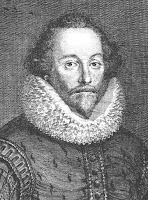
William Shakespeare was an English poet, playwright, and actor, widely regarded as the greatest writer in the English language and the world's pre-eminent dramatist. He is often called England's national poet, and the "Bard of Avon".

The typical modern day image that we have of Shakespeare 

His most famous works according to google(Hamlet being the most well known):

Famous Quotes

Be not afraid of greatness: some are born great, some achieve greatness, and some have greatness thrust upon them.
To thine own self be true, and it must follow, as the night the day, thou canst not then be false to any man.


David Mitchell as Shakespeare in Upstart Crow 
Comedy Sketch

"A Grumpy little bitchington" - play on modern day language with shakespearian twist  creates humour.


Tuesday 14 March 2017

YCN Greenalls: New Idea Needed Urgently!!!

After my recent attempt with animation to answer this brief, I decided that it was no longer going to be worth the time that it would take to complete it, and I lost complete interest in making it. I also thought the concept didn't answer the brief in every aspect, as much as I tried to force it.

So I returned to my sketchbook and started out with British sayings that use the word 'All's'. 

I'm not sure how I came up with this but I thought it was a good starting point, eventually resulting in this...


Boom. Shakespeare. Shakespeare is quintessentially British and definitely ties in with the whole 'traditional'/'London Gin' thing. I think that Shakespeare could be a really good angle for the project because he's incredibly well known and could have some kind of cheeky/comical effect to reiterate the Greenall's brand values.

I also started doing some research into shakespeare as a whole, and found that 2017 will be 400 years since shakespeare's death, so I could make it relevent by creating some sort of celebratory edition of Greenalls? I feel that as shakespeare is such an iconic/well known character, this idea would appeal to the millennial audience.

I prefer this idea so much more though and think that the idea of 'bad weather' was so surface level/undeveloped. 


In addition to my idea, I found this recent cartoon for the new yorker by Jason Adam Katzenstein. He has also used shakespeare in his image and a play on a famous shakespeare saying 'Shall I compare thee to a summers day?' to create humor, which is slightly similar to my idea. I think it's effective how I just instantly knew it was shakespeare (without any sign) because of the visual clues of costume etc, which are elements I intend to take from this to use in my own work. 

YCN Greenalls: I'm not good at animating???


I've just finished animating what I've created for the project so far in After Effects, using royalty free sound effects that I collected from online. In some ways I think the animation is successful because it maintains a punchy energetic feel, taking inspiration from Parallel's 'Unsatisfying' video reel. I've used the colour green to reiterate the brand identity of Greenall's, using short punchy scenes to create a light hearted and fast paced tempo. I think in some frames the visual quality and composition elements work really effectively in order to communicate certain environments.

However

I do not think that overall this is heading in the direction anymore. I really need more than a basic knowledge of After Effects to make this work and just feel that with the amount of time I've got before the deadline, there's not alot of point continuing with this idea? I'm also really struggling to stay interested in it because I'm not confident that when it's finish it will be worth all the work.

I'm happy with the animation stills that I've created and think that some of them would make effective portfolio pieces, displaying a way that I have communicated a brand's values/aesthetic through my images, and I'm glad that i've had the oppurtunity to explore animation. I'm disappointed however because I've obviously wasted a lot of time on this idea, and have probably sacrificed my chances of succeeding in the competition. In future I need to experiment in alot more depth/create mockups in order to identify a successful way of working, which I feel I did not do here. 

I'm still going to attempt the brief, just going down a shorter/more focused path, using a really developed idea. 

YCN Greenalls: More Animation Stills


It's coming together alot now but in some ways I'm struggling to achieve consistency across each frame? - the same illustrative quality/style I feel is lacking in some frames. Not sure if it's just me losing interest in this idea or if it's the way that the animation has visually moved to more shadowy scenes, however I just don't think it looks fully professional at the moment. 

Also for me to create a completely illustrated/3d environment in each frame, it is going to take a very long time in terms of adding small details. Something about this idea just isn't working for me anymore, and i'm not sure how I can keep pushing it?

Sunday 12 March 2017

YCN Greenalls: Animation Stills


I did some more work on the 'Through the wind and rain' animation today and I like the direction it's going in. I think i've used the square crop really effectively and cinematically to communicate the important elements of the story I'm trying to tell, aswell as continuing the use of green. In the last frame I've included some umbrellas that I'm thinking will develop into a huge part of the campaign, thinking about Product/Place/Packaging. Also I think the umbrella is an excellent motif and something typically british that could represent the Greenalls brand effectively.

Saturday 11 March 2017

Cosmetics Brief: PLATO - Final Outcomes

These are *my* finalised outcomes for Plato, in which I have focused on product design and promotional material to build a clearer picture of our brand, and market our product in a professional way. 

Personally I don't feel this brief was that engaging for me as I struggled to have an illustrative input. My roles within this project were all very aesthetic with little concept to go off. However using research and visual inspiration I feel I was able to assimilate trends, colour schemes and ideas to create our own believable and professional looking outcome. 

- For evaluation, see project report -

Wednesday 8 March 2017

Cosmetics Brief: Product Mockups

These are some final product realisations from my collaborative product design brief for 'PLATO' cosmetics. Because of the complex design of our box, I felt it would be beneficial to attempt to create a mockup using rendering techniques in photoshop. I think I have quite a good understanding of shadows and light, and so I applied this knowledge creating 3D visualisations of our proposed product.


I think the box looks really effective, which I feel would appeal to our target audience. I think that all our design choices have created a product that looks quite luxurious, with a really trendy colour scheme appropriate to our concept.


In order to start creating some finalised pieces for submission, I made some poster/promotional material, using my rendered image of the box. Through these designs I wanted to commnicate mystery and the ocean, which I have done by creating a dark and shadowy atmosphere, and creating sea like textures in photoshop. In my market research I identified dark colours being used to convey luxury, which I have taken inspiration from here, but also to communicate our concept of mystery and being at the bottom of the sea.

Tuesday 7 March 2017

Cosmetics Brief: Box/Packaging Design


Visual Inspiration

A big part of our design was going to be the physical appearance of the box, in which we wanted to create a luxurious unique design as well as it being functional. We felt that the more the design was unique and striking, it would encourage people to share it online on social media sites like instagram. Also the box could be something that is kept and treasured. 
Atlantis Shape

Before physically making the box I thought it would be a good idea to mock it up digitally as best as possible, just so that we didnt waste too much time if it looked ineffective. To start the process of designing the box, I created a basic shape to show where there would be dividers inside. We wanted the box to have a unique appearance based loosely around the supposed shape of atlantis, just communicate the story/context a bit more. This is where I decided to have a go at 3d rendering using photoshop, as I feel like I have a good working knowledge of light and shadow and where it should fall on an object.


I created these linear plans in illustrator, and projected it upwards so that I could start creating a digital 3d mockup. I then started adding gradients to the inside of the book to create a realistic 3D effect. I think that the box looks really striking, and will look amazing with all the various products inside it. 


I also mocked up the inside of the box using the other pattern design, further reflecting the concept of the inside of a shell/hidden treasure at the bottom of the ocean.


I feel like the inside pattern makes the box look a bit cheap - unless it was created using marbling pearlised inks maybe? I just feel like the colour scheme is too 'the little mermaid' which doesn't reflect our intentions for a luxury brand atall.

Bag Design


This is what the packaging would look like if the brand was to develop and grow into a chain of stores, which i've identified as a possibility for our product. Once again I used both patterns inside and out of the bag to reflect a concept of mystery and magic inside, or something being concealed, like Atlantis was by the ocean. This is the running concept throughout this design brief. 

Friday 3 March 2017

Illustration Friday/Typography: Scoop


So this is my response to the word 'scoop, in which i'm starting to identify a way of working that I quite enjoy and adds another element to my practice; another string to my bow. I'm really happy with this response, mainly because of how easy the word 'scoop' was to produce. I feel like the word 'scoop' has heavy visual connotations anyway which I just played on. I really enjoy the soft/shiny but 3D effect that these images are creating, as I feel like although looking 3D it still has an illustrated/crafted feel. I also like the way it's an oppurtunity to experiment with colours to further communicate the meaning. 

This project is really starting to make me think about ways that these outcomes could be utilised for commercial purposes. It definitely lends itself to advertising campaigns, but I feel that editorial could be another route. I've not dabbled in Editorial much in my practice so far, and I feel like this could be a way of effectively utilising it. 

In my next outcome I would like to try and stray away from keeping the actual letters, and making a completely illustrated/concept based typography.