My Secret7" Submission (Now that I have not been chosen)
Monday 28 March 2016
Responsive: Secret 7 - Bad News
Monday 21 March 2016
Applied Illustration: Contextual Research
I have decided to make an illustrated travel guide to the top 5 nature expeditions in the world, featuring products from Fjall Raven. I decided to look into existing products to see if there was much of a market for this type of product.
Here are some examples of illustrated city guides, from the publishing company viction:ary, who specialise in publishing and book design. I think these are books are really lovely in terms of their design and how they work together as a set. I know that the company employed local artists from the appropriate areas to design their covers, giving it a personal touch. However it is more the concept of an illustrated travel guide that i am interested in, as opposed to the front cover. Would it's purpose be defeated by an average travel guide that uses photography instead of drawn images? Do people rely on travel guides for Photography and visually accurate representations of places? could this be achieved through illustration?
Images from Berlin guide from viction:ary
These images from the illustrated guide to berlin show a level of personality and fun that could not be created by photography. Aswell as giving it an aesthetic quality, the drawings help to break down the information into digestible elements, an aspect i intend to take forward into my own product.
Aesthetic Quality
In terms of pushing my style visually, I would really like to explore the use of pencil as I really love the authentic hand made element it creates. In these particular Images, pencil is used really effectively, especially when used with various additions of colour.
The Beard That Was Evil
Applied Illustration: Artist Research
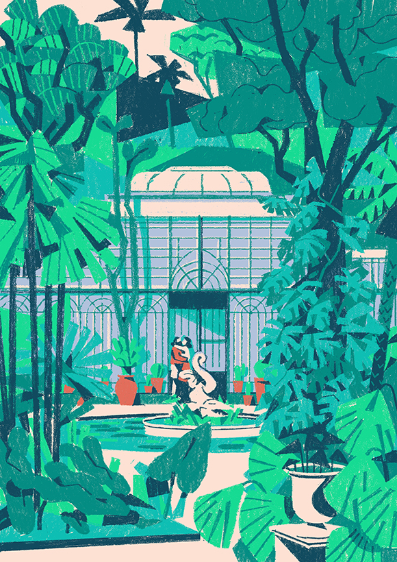
Shuka Bureau
Really vivid use of colour. Creates powerful atmosphere in the images. Really like the composition also of the leaves in the foreground, used to frame the image.
Matteo Berton
Effective use of texture and media. Colours once again are atmospheric and vivid. Nice expressive quality. contrast to the perfectly straight line work of the architecture. I'm pretty sure these were created using digital photoshop brushes, however I think they maintain a really nice authentic texture.
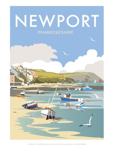
Dave Thompson
Really slick use of vectors and colour, atmospheric and believable. Almost gives each place an identity.
I really like how his work focuses mainly on the use of boats within a landscape, gives his work a unique edge, and helps them to work really nicely as a set.
I find these artists all to be really inspirational in their own ways, mainly through use of colour. Looking at them has made me realise the importance of colour in terms of creating an atmosphere, which helps the audience to engage with them. I particularly like Dave Thompsons use of colour because it's subtle, and not too surreal, but still creates a powerful atmospheric effect. I think that the use of vectors and light coloured shapes also hint at subtle quiet movement in the image.
Applied Illustration: Research
Infographics - Pinterest
Relate to the travel genre, but refer to more digital platforms and focus more heavily on illustration and diagrams?
From looking at these images it could be said that info graphics don't rely on well crafted illustration. Just use vectors, simple shapes to get their idea across.
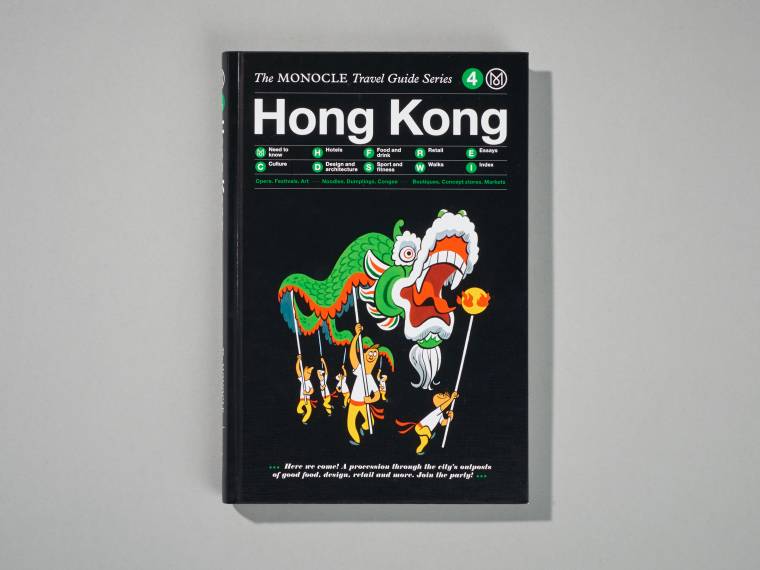
Monocle
Quite an old publication, may have elements of stereotyping, old fashioned views. Still an illustrated travel guide none the less. There doesn't seem to be alot of recent publications like this, gap in the market?
Wednesday 16 March 2016
Monday 14 March 2016
Applied Illustration: Advanced Publications in Indesign - Workshop
Saddle Stitched Pamflet Bind
- File > New > Document
- (Page Size is actual size of single page in your booklet.)
- Layout Grid: column grid, used to assist in aligning our content on the page.
- Bleed > compensates for any inaccuracies in trimming. (Full Bleed - Image/content that fits the full page) Standard bleed amount is 3mm. Gives you red margin, extend image to that. Prints crop marks, shows wear to position metal ruler in order to trim.
- Both bleed + slug define area that sits outside the page, that will print. Slug is used for registration/crop marks.
- Total number of pages must be a multiple of 4. (e.g 12 page booklet would be printed on 3 sheets of paper, which would then be folded and bound).
- Facing Page check box: All about making this kind of publication. If you tick facing pages, shows on screen exactly the format that you will have. Readers spread.
- One thing you should consider is how you are going to print/produce your book. Page size can have a consequence on how/where you are going to print it > remember if using a bleed, you have to print bigger than desired page size.
200x280, 12 page booklet with 3 column grid.
- Hold shift key to select multiple/all of your pages on full preview.
- Layout > Create Guides (more possibilities for grids)
6 rows x 3 columns
- To lock guides: View > Grids & Guides > Lock Guides
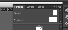
- Master Page: Just above first page on side bar preview, A-Master is the master page that is associated with this document.

Every page is based on A-Master.
- Double click on master page, then you will view it in document window. Everything you have on your master page will be automatically added to every page in booklet. IF you need anything consistent it is easily achieved.
Page size considerations
Consistency with document
Linked text frames
Easy Concertina
Image Considerations
Thursday 10 March 2016
Applied Illustration: Revised Project Proposal
Project Rationale:
I intend to create promotional material for Outdoorwear brand Fjallraven, in the form of an information guide to nature expeditions around the world. I really appreciate the brand values of Fjallraven, which include; making it easier for people to enjoy the countryside, and to do this whilst maintaining an eco friendly approach to product development and distribution. Aswell as my connection with this brand, I feel that my artistic approach of drawing landscapes and people would resonate perfectly. I intend to make my images based on the premise of expanding to other promotional platforms, like billboards etc, and creating an online presence for them. My images will also need to be inkeeping with Fjallraven's brand image.
Themes/Subjects:
Advertising, Promotional Illustration, Informative, Nature
Hiking, Exploring, Adventure, Scenery, Landscapes, Travelling, Outdoor wear, Equipment
Practical & Conceptual Application:
Specific Disciplinary Area:
Advertising/ Promotional
Book Design
Contextual References
Fjall Raven Photographers (Images on websites) - Really Atmospheric and well executed, displaying products and scenery.
Tom Clohosy Cole - Use of digital Media
Michael Driver - incorporation of texture into shape driven illustration
Creative Skills
I will capitalise on my digital rendering skills as I feel really comfortable with drawing digitally. I would like to push it however by exploring mixed media.
Responsive: Collaborative - Final Bottle Design
Here are the final images to be used in the submission slides to D&AD . I think that as a team we've successfully managed to create a product that encourages people to drink Desperados but also want to party, neon style. The design is really fun and colourful and almost carnival like. If we'd have had more time we would have attempted to create a physical prototype, however I don't think our budget for the project would've allowed it. I think these images communicate effectively what it is we're trying to achieve, which is the main thing.
Tuesday 8 March 2016
Applied Illustration: Brand Research
To get a feel for the brand I decided to look at their online presence and how they market themselves visually. What graphic aspects do they use etc. I particularly admire their use of typography and font. I think that the bold, red and playful font really compliments the muted, authentic and almost scientific(?) imagery. Colours are very elegant, and apart from the font, are very natural shades.
They use alot of photography that is often very atmospherically shot using muted colour palettes. Featuring people and products in picturesque places.
Instagram: Picturesque Landscapes, beautifully shot.
A leaflet/small poster I received with an order. The graphics are very authentic looking, with a modern twist. The use of stock is quite thick and textured, but gives it a high quality finish. I really love the use of high quality newsprint(?) and is gives the product a really stylish finish and once again creates authenticity.
Target Audience
In terms of target audience, It is clear that Fjallraven reach out to all ages, as can be seen in their product range. However, I feel that their brand image and website design etc is really sophisticated reaching out to a more mature audience. Because of the muted colour scheme and well crafted images, there is a clear sense of high quality products running throughout their online presence.
Aswell as being high quality, the products they sell are quite high end in terms of price. This gives some sort of indication as to who they are attempting to reach. Hiking enthusiasts, more mature generation? People who disposable income, OR people who will spend everything they have to pursue their passion for the outdoors.
I feel that if I remain in keeping with fjallraven's aesthetic, I do not feel that target audience will be a huge issue for me when creating my illustrations. Aslong as I maintain a high quality finish and nice printed outcomes I feel I will do that effectively.
Applied Illustration: Research into Illustrated Ad Campaigns
Illustrated campaigns for product advertising
Illustrated Campaign for Volskwagen - Tom Haugomat
http://www.itsnicethat.com/articles/volkswagen-tom-haugomat
http://www.handsomefrank.com/illustrators/tom-haugomat/
Used as a double page spreaad in a magazine, or billboard.
Used as a double page spreaad in a magazine, or billboard.
Illustrated Campaign for Volkswagen - Iv Orlov
http://www.brandingmagazine.com/2013/09/25/volkswagen-weekenders/
Green Man festival - HEDOF
Advertising for Frontier beer - Tom Clohosy Cole
From looking at these existing advertisements, It is clear that illustration used in a promotional sense to advertise a particular product gives the brand/product more of a personal touch? advertises the product in an abstract but more emotional/powerful way. It is easier to relate to illustration than a photograph.
Using products as subject matter seems like a challenge in this type of advertising. When advertising a product, it seems almost necessary to use an photograph, so when illustrating it, the drawing will have to have to be realistic in some way. Would this be the same for a Travel guide, where people rely on photographs and factual/true images to see where they are going?
Monday 7 March 2016
Applied Illustration: Desperate Idea Change
Since researching and attempting to respond to my chosen theme of 1950's america, I have found it hard to give my work an actual purpose and it is very up in the air. I feel that this module is the opportunity to do my dream project and I am not using it wisely; I am proposing that I change my idea in terms of content, which will hopefully give my outcome a purpose.
The brand I am interested in creating work for is Fjall Raven, of which I am a huge fan. They are a swedish outdoor products company who "make it easier for people to enjoy the countryside".
I really love the values of the brand and think that the content will resonate nicely with the type of work i like to make. The visuals that come with the brand are so nice and I think it would be fun to respond to the theme with illustration. I am currently thinking of creating a product, for example an illustrated guide to nature expeditions of the world, and using it as a platform for advertising the fjall raven brand. I would really like to explore book design aswell as creating an online presence for the product.
Starting Points
Nature walks around the world
Expeditions
Adventure
Camping
Outdoors
Countryside
Hiking
Weather
http://www.roughguides.com/gallery/epic-walks/#/20
http://adventure.nationalgeographic.com/adventure/trips/best-trails/worlds-best-hikes-dream-trails/#/tour-du-mount-blanc-best-hikes_68721_600x450.jpg
-
Since studying graphic design at college, I have always been a fan of branding and wanted to include it in my illustration work, but never found the chance. I am really hoping to create work for an already established brand, perhaps in the hope that if I did it well they would use it for their campaigns, yet i am currently unsure as to if the course would expect me to contact the brand and ask for their permission, even though I do'n't intend to put it anywhere. I feel like creating work to advertise a product would be alot better for me as an individual and would create more of an effective project.
I really love the values of the brand and think that the content will resonate nicely with the type of work i like to make. The visuals that come with the brand are so nice and I think it would be fun to respond to the theme with illustration. I am currently thinking of creating a product, for example an illustrated guide to nature expeditions of the world, and using it as a platform for advertising the fjall raven brand. I would really like to explore book design aswell as creating an online presence for the product.
Starting Points
Nature walks around the world
Expeditions
Adventure
Camping
Outdoors
Countryside
Hiking
Weather
http://www.roughguides.com/gallery/epic-walks/#/20
http://adventure.nationalgeographic.com/adventure/trips/best-trails/worlds-best-hikes-dream-trails/#/tour-du-mount-blanc-best-hikes_68721_600x450.jpg
Applied Illustration: Visual Journal
-
not interested in this topic.
failing to reach a rounded conclusion + purpose for a product based on this theme.
could be educational, but it doesn't interest me and Consumerism is such a broad topic.
Idea Change?
Subscribe to:
Posts (Atom)


