
Shuka Bureau


Really vivid use of colour. Creates powerful atmosphere in the images. Really like the composition also of the leaves in the foreground, used to frame the image.
Matteo Berton
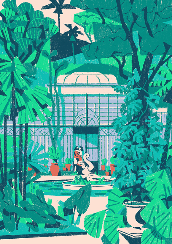

Effective use of texture and media. Colours once again are atmospheric and vivid. Nice expressive quality. contrast to the perfectly straight line work of the architecture. I'm pretty sure these were created using digital photoshop brushes, however I think they maintain a really nice authentic texture.
Dave Thompson


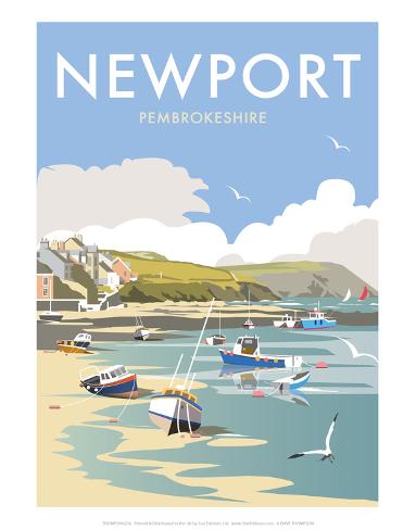
Really slick use of vectors and colour, atmospheric and believable. Almost gives each place an identity.
I really like how his work focuses mainly on the use of boats within a landscape, gives his work a unique edge, and helps them to work really nicely as a set.
I find these artists all to be really inspirational in their own ways, mainly through use of colour. Looking at them has made me realise the importance of colour in terms of creating an atmosphere, which helps the audience to engage with them. I particularly like Dave Thompsons use of colour because it's subtle, and not too surreal, but still creates a powerful atmospheric effect. I think that the use of vectors and light coloured shapes also hint at subtle quiet movement in the image.
No comments:
Post a Comment