
I recently received feedback from Chris about the previous typographic responses I sent to him. In terms of the slogan he was happy with me to go ahead with. but he agreed that the use of colour was a little bit too much and that it should still have a professional aestethetic.


So I returned to typgoraphic responses without the bold colour, using navy blue as (from my research) this communicates reliability, which is ideal for this genre of marketing. From playing around with the type I discovered a way that I could use the type to communicate, creating a line of sight to the middle of the image, relating to the idea of heading in the 'right direction'.

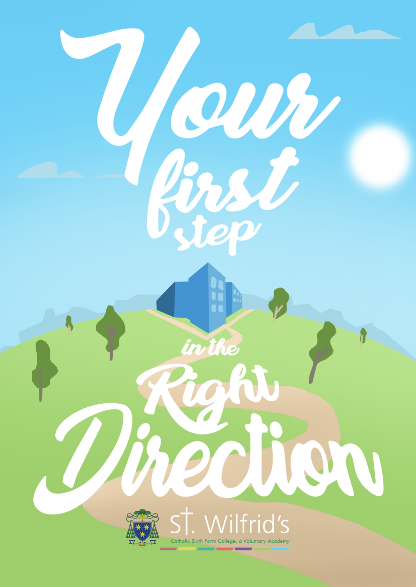
Here I have developed the typeface using dafont, identifying an appropriate cursive but contemporary font, that communicates friendliness but professionalism. I feel that the type gives the image a very modern feel which could communicate how the college resources are uptodate/nice new buildings etc. The image on the left is still in need of refinement but I think it shows a way that I have adapted my usual visual style to be appropriate to educational marketing. Although I feel the image be more developed and could communicate alot more, i think its a good concept, using leading lines to create focus in the image.


I also decided to play on the idea of corridors, which funnily was something that I noticed whilst visitiing St Wilfrids, their buildings are huge with the longest corridors I've ever seen. In these developments I utilised the bold colours from the logo, but using a dark navy colour to still maintain a professional finish. These Images are definitely still in need of refinement but will once again be sent to chris to see what he thinks.
Depending on the feedback from Chris, I intend to develop a set of responses using this concept of using the font to direct your attention. I will then start developing and adapting my outcomes to suitable platforms and contexts.
No comments:
Post a Comment