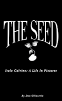
The front cover for my book was something I struggled with quite a bit, as I didn't really have a clear idea of the feel I was going for. Was it going to be illustrated? Just text? Any particular motifs to include?
Here are some mockups I created based around concepts from my book. As my book is going to be called 'The Seed', I experimented with the motif, making it interact with text, and inside silhouettes etc. I then created this design in photoshop (below), which I felt gave my book quite a classic look. I had to manipulate type quite alot to make it look the way I wanted, but I feel it is a successful design for my sleeve. From researching into existing products and books, I found the idea of paper cutting to make the sleeve alot more decorative and interactive with the design of the book.
My final sleeve that was presented was alot more simple than I'd hoped, as I intended to use text on my cover, which would have ideally been screen printed on. However, after my recent struggles with print, I felt that it would cost alot of time, and so I used this simple, and quite mysterious design which frankly illustrates the title 'the seed'. I really like the ambiguity of the sleeve and feel that it would make my audience interested to open it. I think that it gives the book a really delicate feel which I enjoy also.
For the Colours May Vary show, I would ideally like to combine the idea of paper cutting with printed text to really give my book a more professional finish.


No comments:
Post a Comment