


Source: Ranganath Krishnamani & Unknown Artist (found on Pinterest)
After looking into vector illustration alot more, I came across these 2 images on pinterest. I think they are both excellent examples of innovative uses of Illustrator and vectors. The idea of 3D projection is something I've never really thought about it, however have done alot of in high school. I think this would be an really effective pathway for me to go down because I understand 3D projection quite well and would be able to simulate it using illustrator.
In terms of aesthetic, I think these 2 images are really nice. I love their minimalistic composition and the use of negative space surrounding them, referring to the last artist I looked at. I really like the natural and simplistic colour scheme used in the right image, and the reoccurrence of green provides a clean, natural effect to the image. Although there is not alot of authenticity in the images, I tend to find that alot of vectorised images are unable to create this.
---
Upon discussing this idea with my tutor, to illustrate a table layout with various objects relating to that place, I was instructed to draw more and try and get my head around what the objects would look like.


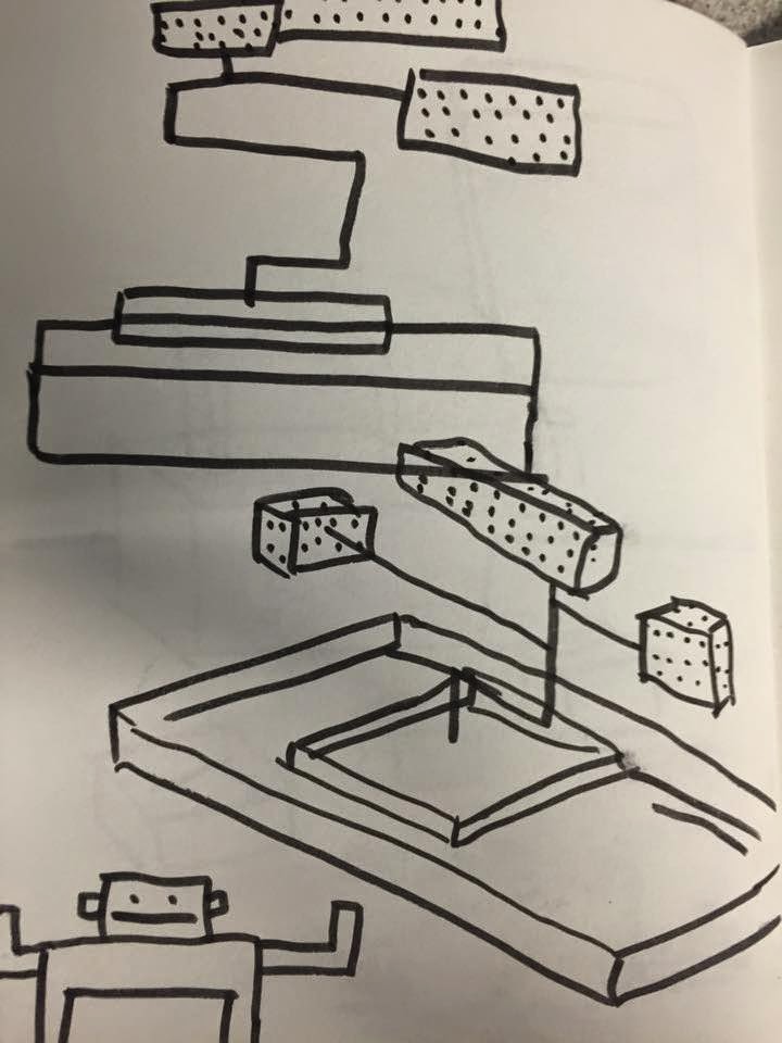
Then I found myself drawing objects in unusual shapes, going back to what Kristyna said in my tutorial. I started to expieriment with cube like objects and a 3D aesthetic, which I thought would give my images an unusual and surreal look.

No comments:
Post a Comment